[Image]
Feature-heavy platforms depend on users being able to locate and use the right tools quickly. For product designers and managers, the challenge is ensuring important features are discoverable, easy to access, and aligned with how users expect to navigate the product.
Feature Findability Testing uses a design stack of UX metrics: usefulness, usability, and satisfaction to measure how well features can be located and applied. This approach replaces subjective opinions with measurable insights.
With these findings, designers and managers can make informed design decisions, prioritize improvements, and demonstrate the impact of changes on business outcomes. For example, testing an ad campaign management platform’s audience targeting features revealed that users rated usefulness highly but struggled with usability, showing that navigation patterns needed refinement to better support campaign setup.
Define Goals for Your Feature Findability Test
A product’s feature findability should balance user needs like clarity, guidance, and accessibility with business goals such as adoption, retention, and maximizing ROI from product development. Tracking how easily features are found and used ensures both sides benefit.
Audience
To define user needs, you first need to establish who your audience is. In the case of our Advent ad management platform, we targeted advertisers and marketing decision makers who might be interested in their ad campaign solutions.
User Needs
As a customer discovering and using features in a product, the five most important user needs would be:
-
Features should be easily located without unnecessary searching or friction. (Features should be Findable)
-
Features should instantly make sense, reducing the need for extra explanation. (Features should be Intuitive)
-
Features should solve real problems or add clear value to the customer’s experience. (Features should be Useful)
-
Features should provide clarity and guidance, helping customers understand how and why to use them. (Features should be Insightful)
-
Features should be designed so everyone, regardless of ability or device, can discover and use them fully. (Features should be Accessible)
These five ensure features feel visible, understandable, and valuable, meeting core expectations for ease of discovery and use.
Business Goals
Here are the five most important business goals for feature findability:
-
Increase Feature Adoption – Ensure both new and existing features are regularly discovered and actively used.
-
Maximize ROI on Development – Convert the cost of building features into measurable usage and business impact.
-
Reduce Support Costs – Lower the volume of support requests by making features easier to find and understand.
-
Improve Customer Retention – Keep customers engaged and satisfied by helping them see and use ongoing product value.
-
Collect Usage Insights – Track which features are discovered, ignored, or misunderstood to inform product and design strategy.
These goals help the business drive adoption, reduce wasted investment, and increase customer lifetime value through stronger feature findability.
Choose Metrics to Test Your Feature Findability
For Advent’s feature findability test, a design stack of three UX metrics was chosen to measure how well users can discover and use key functions. This stack — Usability, Usefulness, and Satisfaction — was established by mapping the most important findability needs directly to measurable outcomes:
-
Findable, Accessible, & Intuitive → Usability Features should be easy to locate and simple to operate. Usability measures whether participants can find and use the right controls without friction.
-
Useful → Usefulness A feature must provide clear value once discovered. Usefulness measures whether participants feel the feature is worth their time and supports their goals.
-
Insightful → Satisfaction Users should leave with confidence that the feature added clarity or made their task easier. Satisfaction reflects whether participants felt positive about the experience after using the feature.
Establish Hunches to Direct Your Testing
For tools like audience targeting, findability and clarity are critical. If users can’t easily locate or understand how to adjust parameters, the value of the feature drops and support costs rise. We start with hunches about weak spots or opportunities, then turn those into questions for testing.
Example: Advent Audience Targeting
<table xmlns="http://www.w3.org/1999/xhtml" style="min-width: 75px;"><colgroup><col style="min-width: 25px;"><col style="min-width: 25px;"><col style="min-width: 25px;"></colgroup><tbody><tr><th colspan="1" rowspan="1"><p>Hunch</p></th><th colspan="1" rowspan="1"><p>Question</p></th><th colspan="1" rowspan="1"><p>UX Metric</p></th></tr><tr><td colspan="1" rowspan="1"><p>The filtering panel on the left (Attribute Groups, Size, Program Areas, etc.) may feel overwhelming, leading users to struggle with finding the right parameters quickly.</p></td><td colspan="1" rowspan="1"><p>“How easy or difficult was it to apply the filters you needed when setting up your audience?”</p></td><td colspan="1" rowspan="1"><p><a target="_blank" rel="noopener noreferrer nofollow" href="https://glare.helio.app/define/ux-metrics/behavioral-metrics/usability">Usability</a></p></td></tr><tr><td colspan="1" rowspan="1"><p>The list of audiences in the center may be too uniform in presentation, making it difficult for users to scan, prioritize, or compare audience options.</p></td><td colspan="1" rowspan="1"><p>“What’s the first thing you would click on to evaluate which audience is right for your campaign?”</p></td><td colspan="1" rowspan="1"><p><a target="_blank" rel="noopener noreferrer nofollow" href="https://glare.helio.app/define/ux-metrics/behavioral-metrics/usability">Usability</a></p></td></tr><tr><td colspan="1" rowspan="1"><p>Important details in the right-hand sidebar (like Business Revenue, Reach, and Audience Saturation) may be overlooked because they are visually separated from the main list.</p></td><td colspan="1" rowspan="1"><p>“How helpful did you find the information in the sidebar when evaluating your selected audience?”</p></td><td colspan="1" rowspan="1"><p><a target="_blank" rel="noopener noreferrer nofollow" href="https://glare.helio.app/define/ux-metrics/attitudinal-metrics/usefulness">Usefulness</a></p></td></tr><tr><td colspan="1" rowspan="1"><p>The “Edit Audience” buttons may not fully convey what kind of changes can be made, causing uncertainty about whether it’s safe to proceed.</p></td><td colspan="1" rowspan="1"><p>“When you clicked ‘Edit Audience,’ how confident were you in knowing what actions you could take?”</p></td><td colspan="1" rowspan="1"><p><a target="_blank" rel="noopener noreferrer nofollow" href="https://glare.helio.app/define/ux-metrics/attitudinal-metrics/posttask-satisfaction">Satisfaction</a></p></td></tr><tr><td colspan="1" rowspan="1"><p>The “Attach to Campaign” CTA at the bottom of the sidebar may be easy to miss or misunderstood in its placement, leading to lower success in moving audiences into campaigns.</p></td><td colspan="1" rowspan="1"><p>“What action would you take to attach an audience to your campaign from this page?”</p></td><td colspan="1" rowspan="1"><p><a target="_blank" rel="noopener noreferrer nofollow" href="https://glare.helio.app/define/ux-metrics/behavioral-metrics/usability">Usability</a></p></td></tr></tbody></table>
These hunches aim to uncover whether features are visible, understandable, and usable. By testing them with real users, Advent can validate whether their targeting tools are intuitive—or whether redesigns are needed to reduce friction and drive adoption.
Turn Hunches into Test Questions
Turning these metrics into participant questions transforms design assumptions into measurable signals. Each metric uses a specific question type paired with a clear example from Advent’s audience targeting page:
- Usefulness **(Likert scale)**
Question type: Agreement scale. Examples:
-
“The targeting options on this page are useful for creating effective campaigns.” (Strongly Disagree → Strongly Agree)
-
“This page provides the right level of detail for selecting an audience.” (Strongly Disagree → Strongly Agree)
[Image]
- Usability **(Average success across tasks)**
Question type: Multi-task click test.
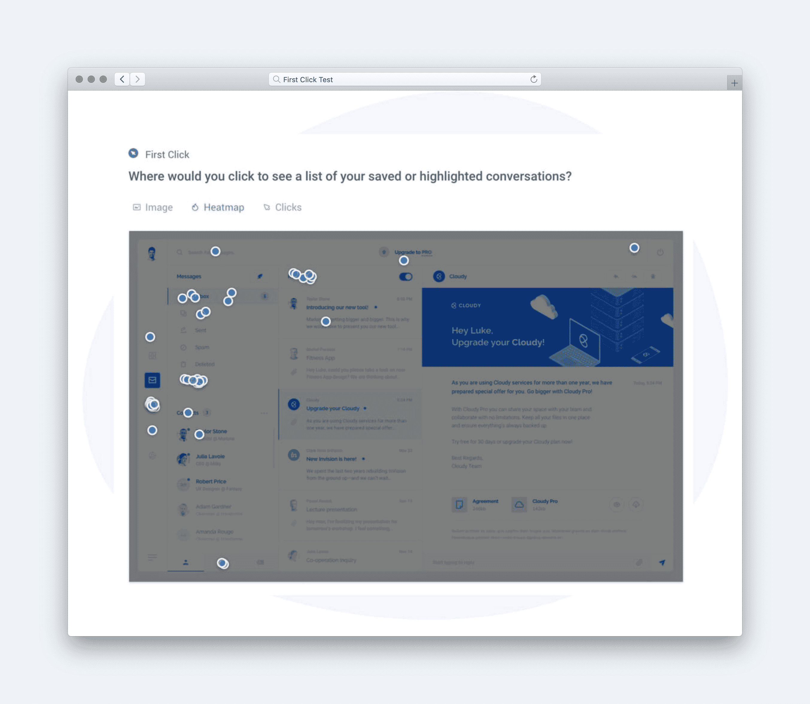
Example: “Where would you click to set an age range for your target audience?” followed by “Where would you click to include location targeting?” (Success rate is averaged across tasks)
[Image]
- Satisfaction **(Likert scale)**
Question type: Satisfaction scale.
Example: “Overall, how satisfied are you with the ease of finding targeting features on this page?” (Very Dissatisfied → Very Satisfied)
[Image]
Calculate UX Metric Scores from User Feedback
We tested Advent’s audience targeting page with 100 advertising and marketing participants, and their responses were analyzed and converted into UX metric scores on a 0–100% scale. Each metric in the design stack was calculated from survey and task responses, then evaluated against the following scale:
-
Very Good = 90% and above
-
Good = 70% to 89%
-
Average = 50% to 69%
-
Poor = 30% to 49%
-
Very Poor = below 30%
Once the individual UX metric scores are calculated, the average of those scores are used to determine the overall score for the user experience.
Here’s how the Advent's audience targeting page performed across each metric:
-
Usability (44% — Poor): Participants struggled with editing parameters, often failing to complete the task efficiently. This lowered confidence in the page’s ease of use.
-
Satisfaction (71% — Good): Despite usability challenges, most participants still reported positive feelings about the available editing options, showing the design has strengths worth building on.
-
Usefulness (74% — Good): Participants felt the targeting options themselves were valuable and relevant, even if interacting with them proved difficult.
[Image]
Together, these results produced an overall test score of 63% — Average. The data highlights a clear tension: users find the targeting tools helpful and are generally satisfied once they get there, but poor usability blocks smooth discovery and adoption. Addressing these usability barriers will unlock stronger satisfaction and increase the feature’s overall effectiveness.
Click here to check out the raw survey data and UX metric scores for Advent's audience targeting page.
Draw Signals from Your Design Stack
Here’s how signals were surfaced from the Audience Targeting test results by following these five steps:
-
Focus on poorly scoring metrics
[Image]
-
Usability (44%) scored Poor, showing that users struggled to edit targeting parameters, a core feature of the experience.
-
Satisfaction (71%) and Usefulness (74%) were only just above Average, suggesting the usability friction dragged down perceptions of both value and enjoyment.
-
-
Identify patterns across metrics
[Image]
-
While users found the editing options somewhat satisfying and useful, difficulty in completing the core action (editing parameters) created friction.
-
This pattern indicates a classic usability bottleneck: when a critical task is hard, it suppresses overall satisfaction and usefulness, even if the feature conceptually provides value.
-
-
Determine if user needs are being met
[Image]
-
Findable: Partially met. Users could locate editing options but struggled with clarity in execution.
-
Intuitive: Not met. Editing parameters did not make immediate sense, requiring more effort than expected.
-
Useful: Partially met. Scores suggest the feature adds value, but not at its full potential.
-
Insightful: Not met. The experience lacked guidance or clarity to help users understand how to edit effectively.
-
Accessible: Partially met. While accessible in terms of reach, task friction meant not everyone could complete it smoothly.
-
-
Compare outcomes to your business goals
-
Increase Feature Adoption: Limited, as core usability issues discourage repeat use.
-
Maximize ROI on Development: At risk—difficulty in using targeting parameters undermines the return on building the feature.
-
Reduce Support Costs: Poor usability likely increases customer support requests.
-
Improve Customer Retention: Weak satisfaction reduces the chance that users will stay engaged with the product long-term.
-
Collect Usage Insights: Limited adoption means missed opportunities to capture valuable usage data.
-
-
Surface signals & establish a direction
**
Signals derived from the data:**-
Usability bottleneck suppresses satisfaction and usefulness — users can find the feature but not easily complete tasks.
-
Guidance and clarity are missing — lack of insight into how to edit creates unnecessary friction.
-
Business value is underdelivered — weak usability blocks adoption, reduces ROI, and increases support costs.
-
Direction based on business context:
To align with goals of feature adoption and ROI on development, near-term priorities should focus on:
-
Redesigning the parameter editing flow to make it more intuitive and reduce friction.
-
Adding inline guidance (tooltips, examples, or contextual help) to make the feature more insightful.
-
Testing refinements quickly in upcoming development cycles to prevent further impact on adoption and retention.
Based on the signals and design direction, we created an updated version of the design with the expected UX metric improvement:
[Image]
The direction is clear: Advent's audience targeting feature is valuable but underperforming due to poor usability. Improving task flows and adding guidance will unlock adoption, reduce support costs, and deliver stronger business impact.