[Image]
Landing pages are essential for communicating a product’s value and motivating users to take action. For product designers and managers, the challenge is balancing visual appeal with clarity and trust so that users immediately understand what’s being offered.
Landing Page Testing uses a design stack of UX metrics: appeal, comprehension, sentiment, and intent to measure how effectively the page captures attention and drives conversion. This approach replaces subjective opinions with measurable insights.
With these findings, designers and managers can make informed design decisions, prioritize improvements, and demonstrate the impact of changes on business outcomes. For example, testing Chime’s MyPay payment service landing page revealed strong appeal but weaker intent, showing where adjustments to message clarity and visual hierarchy could better motivate sign-ups.
Define Goals for Your Fintech Landing Page
A landing page should balance user needs like credibility, clarity, and appeal with business goals such as acquisition, conversion, and brand differentiation. Users want to quickly understand what’s being offered and why it’s valuable, while businesses aim to attract qualified visitors and turn interest into action. Measuring landing page performance ensures both trust and motivation are aligned to drive results.
**Audience:**
This concept was tested with online and mobile banking consumers in the United States who interacted with Chime’s MyPay payment service landing page. Participants were asked to review the page and share impressions of clarity, trust, and motivation to learn more or sign up.
User Needs
As a visitor exploring a payment service landing page, the five most important needs would be:
-
The page should immediately establish trust through professional design, transparent messaging, and recognizable branding (offer should feel Credible).
-
The content should clearly explain how the service benefits users and solves real financial needs (page should feel Valuable).
-
The offer and visuals should feel appealing and emotionally aligned with the audience’s lifestyle or goals (offer should feel Desirable).
-
The layout should make it easy to understand how the product works and why it’s different (page should be Insightful).
-
The page should quickly guide users toward the primary call-to-action without distractions or confusion (interactions should be Efficient).
These five ensure the landing page feels trustworthy, clear, and motivating, giving users confidence to take the next step.
Business Goals
Here are the five most important business goals for a landing page:
-
Increase Conversions – Drive more visitors to sign up, apply, or learn more through focused calls-to-action.
-
Improve Lead Quality – Attract users who are genuinely interested and likely to convert.
-
Strengthen Brand Perception – Present a polished, reliable image that reinforces the company’s positioning.
-
Reduce Bounce Rates – Keep users engaged longer by aligning messaging and visuals with their expectations.
-
Track Behavioral Insights – Measure engagement patterns (scroll depth, CTA clicks) to refine page design and content.
These goals help the business turn first impressions into measurable conversions, while reinforcing brand credibility and customer trust through effective landing page design.
Choose Metrics to Test Your Fintech Landing Page
For Chime’s MyPay payment service landing page, a design stack of five UX metrics was chosen to measure how effectively the page builds trust, communicates value, and motivates action. This stack — Loyalty, Engagement, Comprehension, Sentiment, and Success — was established by mapping user needs directly to measurable outcomes:
-
Credible → Loyalty
Visitors should feel confident that Chime’s service is trustworthy and secure. Loyalty measures whether users would recommend or return to the brand after visiting the page, reflecting long-term credibility. -
Valuable → Engagement
The page should immediately capture attention and motivate exploration. Engagement evaluates whether participants interact with key elements, such as CTAs or feature explanations, showing that the value is clear. -
Insightful → Comprehension
Users should quickly understand how MyPay works and how it benefits them. Comprehension measures whether participants clearly grasp the offer and its main message. -
Desirable → Sentiment
The design should leave users feeling positive and motivated to take the next step. Sentiment captures the emotional impression — whether the page feels exciting, trustworthy, or reassuring. -
Efficient → Success
The experience should make taking action feel effortless. Success measures whether participants can complete key tasks, such as initiating a sign-up or learning more about MyPay, without confusion.
Establish Hunches to Direct Your Testing
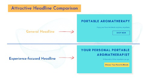
Landing pages for fintech products need to communicate credibility, value, and clarity in just a few seconds. For Chime’s MyPay page, the balance between trust signals, visual clarity, and perceived benefit directly affects user engagement and sign-up intent. These hunches outline where users might hesitate, misinterpret, or feel inspired—each turned into a testable question.
Example: Chime MyPay Landing Page
<table xmlns="http://www.w3.org/1999/xhtml" style="min-width: 75px;"><colgroup><col style="min-width: 25px;"><col style="min-width: 25px;"><col style="min-width: 25px;"></colgroup><tbody><tr><th colspan="1" rowspan="1"><p>Hunch</p></th><th colspan="1" rowspan="1"><p>Question</p></th><th colspan="1" rowspan="1"><p>UX Metric</p></th></tr><tr><td colspan="1" rowspan="1"><p>The headline “The best way to access your pay” is broad and may not immediately explain the unique benefit of MyPay, leading users to skim without understanding how it works.</p></td><td colspan="1" rowspan="1"><p>How clear was it what MyPay actually does when you first landed on this page?</p></td><td colspan="1" rowspan="1"><p><a target="_blank" rel="noopener noreferrer nofollow" href="https://glare.helio.app/define/ux-metrics/behavioral-metrics/comprehension">Comprehension</a></p></td></tr><tr><td colspan="1" rowspan="1"><p>The comparison chart is informative but dense, and may require too much cognitive effort to interpret—especially on mobile.</p></td><td colspan="1" rowspan="1"><p>Was it easy to compare MyPay’s features with the alternatives shown on the chart?</p></td><td colspan="1" rowspan="1"><p><a target="_blank" rel="noopener noreferrer nofollow" href="https://glare.helio.app/define/ux-metrics/behavioral-metrics/success">Success</a></p></td></tr><tr><td colspan="1" rowspan="1"><p>The green-on-green layout reinforces brand consistency but risks blending key CTAs (like “Get Started”) into the background, reducing conversion potential.</p></td><td colspan="1" rowspan="1"><p>Did the call-to-action buttons stand out clearly as the next step to take?</p></td><td colspan="1" rowspan="1"><p><a target="_blank" rel="noopener noreferrer nofollow" href="https://glare.helio.app/define/ux-metrics/behavioral-metrics/engagement">Engagement</a></p></td></tr><tr><td colspan="1" rowspan="1"><p>The testimonials and product mockups provide reassurance, but may appear late in the scroll journey, after the user’s attention has dropped.</p></td><td colspan="1" rowspan="1"><p>At what point in the page did you start to feel confident in the product or company?</p></td><td colspan="1" rowspan="1"><p><a target="_blank" rel="noopener noreferrer nofollow" href="https://glare.helio.app/define/ux-metrics/attitudinal-metrics/loyalty">Loyalty</a></p></td></tr><tr><td colspan="1" rowspan="1"><p>The FAQ and legal disclosure section is heavily text-based and could overwhelm users, creating friction for those scanning for simple answers.</p></td><td colspan="1" rowspan="1"><p>Was it easy to find answers to your questions about how MyPay works?</p></td><td colspan="1" rowspan="1"><p><a target="_blank" rel="noopener noreferrer nofollow" href="https://glare.helio.app/define/ux-metrics/attitudinal-metrics/sentiment">Sentiment</a></p></td></tr></tbody></table>
These hunches help test whether Chime’s landing page achieves trust and comprehension within the first few seconds, ensuring users quickly understand what makes MyPay valuable and reliable.
Turn Hunches into Test Questions
Turning these metrics into participant questions transforms design assumptions into measurable signals. Each metric uses a specific question type paired with a clear example from Chime’s MyPay landing page:
- Comprehension **(5-pt Likert scale)**
Question type: Agreement scale.
Example: “I understand how Chime’s MyPay feature works based on the information on this page.” (Strongly Disagree → Strongly Agree)
[Image]
- Engagement (First-click test)
Question type: Click test.
Example: “Where would you click first if you wanted to learn how to get started with MyPay?”
[Image]
- Sentiment **(Multiple-choice impressions)**
Question type: Impression checklist.
Example: “Which of the following words best describe your impression of this landing page?” (Positive: Clear, Trustworthy, Helpful, Innovative. Negative: Confusing, Overwhelming, Generic, Distracting)
[Image]
- Loyalty (10-pt likelihood scale)
Question type: Likelihood to promote.
Example: “How likely are you to recommend Chime’s MyPay feature to a friend or colleague?” (0 = Not at all likely, 10 = Extremely likely)
[Image]
- Success **(Click test directive)**
Question type: Task-based click test.
Example: “Where would you click to start using MyPay or sign up for an account?”
[Image]
Calculate UX Metric Scores from User Feedback
We tested Chime’s MyPay landing page with 100 participants, and their responses were converted into UX metric scores on a 0–100% scale. Each metric in the design stack was derived from a combination of first-click testing, comprehension questions, and post-task sentiment and loyalty ratings. Scores were benchmarked using the following thresholds:
-
Very Good = 90% and above
-
Good = 70%–89%
-
Average = 50%–69%
-
Poor = 30%–49%
-
Very Poor = below 30%
Once the individual UX metric scores are calculated, the average of those scores are used to determine the overall score for the user experience.
Chime’s Results:
-
Engagement (65% — Average): Participants explored the page adequately but showed limited curiosity beyond the initial hero section, signaling opportunities to make mid-page content more interactive or motivating.
-
Comprehension (83% — Good): Users quickly grasped the MyPay concept, with clear headlines and visual hierarchy supporting strong message clarity.
-
Success (38% — Poor): When asked to locate key actions, such as learning more or signing up, users struggled with CTA visibility and hierarchy.
-
Sentiment (64% — Average): Participants described the design as “clean” and “simple,” but few expressed enthusiasm — suggesting emotional resonance could be strengthened.
-
Loyalty (54% — Average): The page built moderate trust but lacked the persuasive depth to inspire advocacy or strong long-term preference for the product.
[Image]
These findings produced an overall test score of 61% — Average. While Chime’s MyPay landing page communicates its value clearly, it underdelivers on driving action and excitement. Improving CTA prominence, injecting stronger emotional storytelling, and emphasizing real-world benefits could help turn comprehension into meaningful engagement and conversion.
Click here to check out the raw survey data and UX metric scores for Chime’s landing page.
Draw Signals from Your Design Stack
Here’s how signals were surfaced from the Chime landing page test results by following these five steps:
1. Focus on poorly scoring metrics
[Image]
Chime’s MyPay landing page received an average overall score of 61%, showing strong Comprehension (83%) but poor performance in Success (38%), with Engagement (65%), Sentiment (64%), and Loyalty (54%) all landing in the middle. This indicates users understood the offer but struggled to act on it or feel confident enough to convert — a key weakness for a landing page designed to drive sign-ups.
2. Identify patterns across metrics
[Image]
The pattern reveals a clarity-versus-conversion gap. The offer and value proposition are well explained, earning high comprehension, but users didn’t feel compelled or reassured enough to complete the next step. The emotional impression (Sentiment) was lukewarm, suggesting the tone and visuals communicate information but not trust or urgency.
3. Determine if user needs are being met
[Image]
-
Credible: Partially met — users trust the brand’s reputation but need stronger visual signals of reliability (e.g., partner logos, testimonials, or security cues).
-
Valuable: Met — the benefits of early pay access are clearly communicated.
-
Desirable: Not fully met — visuals and messaging lack emotional draw or connection to user lifestyle.
-
Insightful: Met — the explanation of how MyPay works is clear and easy to follow.
-
Efficient: Not met — call-to-action placement and framing don’t effectively guide users to act.
4. Compare outcomes to your business goals
-
Increase Conversions: Not achieved — poor success score indicates weak CTA visibility or motivation to sign up.
-
Improve Lead Quality: Partially supported — comprehension is high, so the right audience understands the offer but may hesitate to commit.
-
Strengthen Brand Perception: Supported — visuals and tone remain consistent with Chime’s brand but need more emotional resonance.
-
Reduce Bounce Rates: At risk — average sentiment suggests users may exit without exploring further.
-
Track Behavioral Insights: Supported — clear metrics can inform CTA placement and messaging improvements.
5. Surface signals & establish a direction
Signals derived from the data:
-
The message is clear but not convincing — users understand the product but don’t feel compelled to take action.
-
Trust cues are underplayed — emotional reassurance and social proof are missing at the moment of conversion.
-
The CTA lacks urgency and clarity — its placement and phrasing fail to capitalize on the high comprehension achieved earlier.
**Direction based on business context:**
To align with Chime’s goals of increasing conversions and strengthening brand perception, the next iteration should focus on:
-
Enhancing the CTA hierarchy and visibility with clearer benefit framing (e.g., “Get Paid Early — Sign Up in Minutes”).
-
Incorporating trust elements such as endorsements, testimonials, or secure partner mentions near conversion points.
-
Reinforcing emotional engagement with relatable imagery or messaging that connects the feature to users’ real-life financial relief moments.
Based on the signals and design direction, we created an updated version of the design with the expected UX metric improvement:
[Image]
The signal is clear: Chime’s MyPay page communicates well but converts poorly. Strengthening trust, emotional connection, and CTA design can turn comprehension into confident action.