[Image]
Filtering and sorting tools are essential for helping users navigate complex financial products, from credit cards to loans. For product designers and managers, the challenge is ensuring these controls feel intuitive and help users compare options with minimal effort.
Fintech Filters & Sort UI Testing uses a design stack of UX metrics: usability, effort, and satisfaction to measure how well users can narrow results and find relevant options. This approach replaces subjective opinions with measurable insights.
With these findings, designers and managers can make informed design decisions, prioritize improvements, and demonstrate the impact of changes on business outcomes. For example, testing Nerdwallet’s credit card search filters revealed strong success but lower satisfaction, showing where filter layout and feedback could be refined to make comparisons more efficient and user-friendly.
Define Goals for Your Filters & Sort UI
A fintech filters & sort UI should balance user needs like clarity, usefulness, and efficiency with business goals such as engagement, lead generation, and user satisfaction. Users want to quickly narrow options and find the best financial product for their needs, while businesses aim to guide users toward relevant offers and increase conversion. Measuring filter behavior helps ensure users feel empowered, not overwhelmed, during financial decision-making.
**Audience:**
This concept was tested with credit card consumers in the United States who explored Nerdwallet’s credit card search page. Participants were asked to use the filtering and sorting tools to find the best card for their needs — such as rewards, APR, or balance transfer offers — and share impressions of clarity, control, and ease of finding results.
User Needs
As a consumer using filters and sorting tools to find a financial product, the five most important needs would be:
-
Filter options and categories should be clearly labeled and easy to locate within the interface (sort should be Findable).
-
The controls should be intuitive, responsive, and easy to adjust without confusion (interface should be Usable).
-
Filters should quickly refine results, helping users reach relevant options with minimal effort (interactions should be Efficient).
-
The results should feel accurate and personalized, reflecting the user’s financial priorities (categories should feel Valuable).
-
The interface should guide users with helpful cues, showing how filters affect outcomes (filters should be Insightful).
These five ensure filters feel clear, responsive, and empowering, giving users confidence in their search results.
Business Goals
Here are the five most important business goals for a fintech filters & sort UI:
-
Increase Product Discovery – Help users efficiently find and explore the most relevant credit card options.
-
Boost Conversion Rates – Connect users to high-value partners or offers through clear, guided navigation.
-
Enhance User Satisfaction – Deliver a smoother, faster filtering experience that builds trust in recommendations.
-
Reduce Drop-Off Rates – Keep users engaged longer by simplifying comparison and decision-making.
-
Collect Behavioral Insights – Track filter usage and click patterns to optimize product listings and personalization.
These goals help the business improve engagement, strengthen trust, and increase lead quality through a clear, customer-centered filtering experience.
Choose Metrics to Test Your Filters & Sort UI
For Banko’s transaction filtering interface, a design stack of three UX metrics was chosen to measure how effectively the filters and sorting tools help users find and organize financial information. This stack — Usability, Effort, and Satisfaction — was established by mapping user needs directly to measurable outcomes:
-
Findable & Usable → Usability
Users should be able to easily locate and apply filters or sorting options to narrow their results. Usability measures whether participants can use these controls accurately and intuitively without confusion. -
Efficient → Effort
The filtering process should feel streamlined and quick. Effort evaluates how easy or difficult participants found it to complete filtering actions, showing whether the interface minimizes unnecessary steps. -
Insightful & Valuable → Satisfaction
The final results should help users gain clarity and confidence in their data. Satisfaction captures whether participants describe the filtering experience as helpful, valuable, and worth using again.
Establish Hunches to Direct Your Testing
In financial product comparison tools, the filters and sorting system must balance clarity, flexibility, and trust. Users often come in with specific needs — like minimizing fees, maximizing rewards, or improving credit — so the interface needs to guide them efficiently without causing choice overload. NerdWallet’s “Best Credit Cards” page delivers extensive comparison data and strong editorial credibility, but the UX challenge lies in how users navigate and act on that information.
Example: NerdWallet Credit Card Comparison Page
<table xmlns="http://www.w3.org/1999/xhtml" style="min-width: 300px;"><colgroup><col style="width: 250px;"><col style="min-width: 25px;"><col style="min-width: 25px;"></colgroup><tbody><tr><th colspan="1" rowspan="1" colwidth="250"><p>Hunch</p></th><th colspan="1" rowspan="1"><p>Question</p></th><th colspan="1" rowspan="1"><p>UX Metric</p></th></tr><tr><td colspan="1" rowspan="1" colwidth="250"><p>The intro text and top section build confidence through transparency (“reviewed and rated by experts”), but may also push key filter actions too far below the fold, slowing first engagement.</p></td><td colspan="1" rowspan="1"><p>How easy was it to find where to start narrowing down card options?</p></td><td colspan="1" rowspan="1"><p><a target="_blank" rel="noopener noreferrer nofollow" href="https://glare.helio.app/define/ux-metrics/behavioral-metrics/success">Success</a></p></td></tr><tr><td colspan="1" rowspan="1" colwidth="250"><p>Hunch 2: The category tabs (Best Cards, Balance Transfer, Travel, etc.) provide structure but might feel like competing navigation layers rather than a clear filtering system — users could hesitate on which applies to them.</p></td><td colspan="1" rowspan="1"><p>How clear was it which category matched what you were looking for?</p></td><td colspan="1" rowspan="1"><p><a target="_blank" rel="noopener noreferrer nofollow" href="https://glare.helio.app/define/ux-metrics/behavioral-metrics/usability">Usability</a></p></td></tr><tr><td colspan="1" rowspan="1" colwidth="250"><p>The rating and reward columns offer helpful comparison details, but the uniform layout of each card block may overwhelm users with repetition, making it hard to identify standout differences.</p></td><td colspan="1" rowspan="1"><p>How easy was it to compare cards and notice what made each one unique?</p></td><td colspan="1" rowspan="1"><p><a target="_blank" rel="noopener noreferrer nofollow" href="https://glare.helio.app/define/ux-metrics/behavioral-metrics/effort">Effort</a></p></td></tr><tr><td colspan="1" rowspan="1" colwidth="250"><p>The “Apply Now” buttons are frequent and visible, but users might question impartiality due to repeated external links and affiliate disclosures — possibly eroding trust in the recommendations.</p></td><td colspan="1" rowspan="1"><p>How confident did you feel that the site’s recommendations were unbiased?</p></td><td colspan="1" rowspan="1"><p><a target="_blank" rel="noopener noreferrer nofollow" href="https://glare.helio.app/define/ux-metrics/attitudinal-metrics/posttask-satisfaction">Satisfaction</a></p></td></tr><tr><td colspan="1" rowspan="1" colwidth="250"><p>The secondary “Find the right credit card for you” tool adds value but may appear too late in the scroll journey, missing users who would benefit from guided assistance earlier.</p></td><td colspan="1" rowspan="1"><p>How helpful would it be to answer a few questions to get personalized card matches before seeing all the options?</p></td><td colspan="1" rowspan="1"><p><a target="_blank" rel="noopener noreferrer nofollow" href="https://glare.helio.app/define/ux-metrics/behavioral-metrics/usability">Usability</a></p></td></tr></tbody></table>
These hunches explore whether NerdWallet’s credit card comparison design helps users filter efficiently and act confidently, or if the abundance of similar data introduces friction, fatigue, or skepticism before conversion.
Turn Hunches into Test Questions
Turning these metrics into participant questions transforms design assumptions into measurable signals. Each metric uses a specific question type paired with a clear example from NerdWallet’s credit card search experience:
- Satisfaction **(Likert scale of satisfaction)**
Question type: Satisfaction scale.
Example: “Overall, how satisfied are you with the ease of finding and using filters on this page?” (Very Dissatisfied → Very Satisfied)
[Image]
- Effort **(7-pt scale of difficulty)**
Question type: Difficulty rating scale.
Example: “How easy or difficult was it to apply filters to narrow down credit card options?” (1 = Very Easy → 7 = Very Difficult)
[Image]
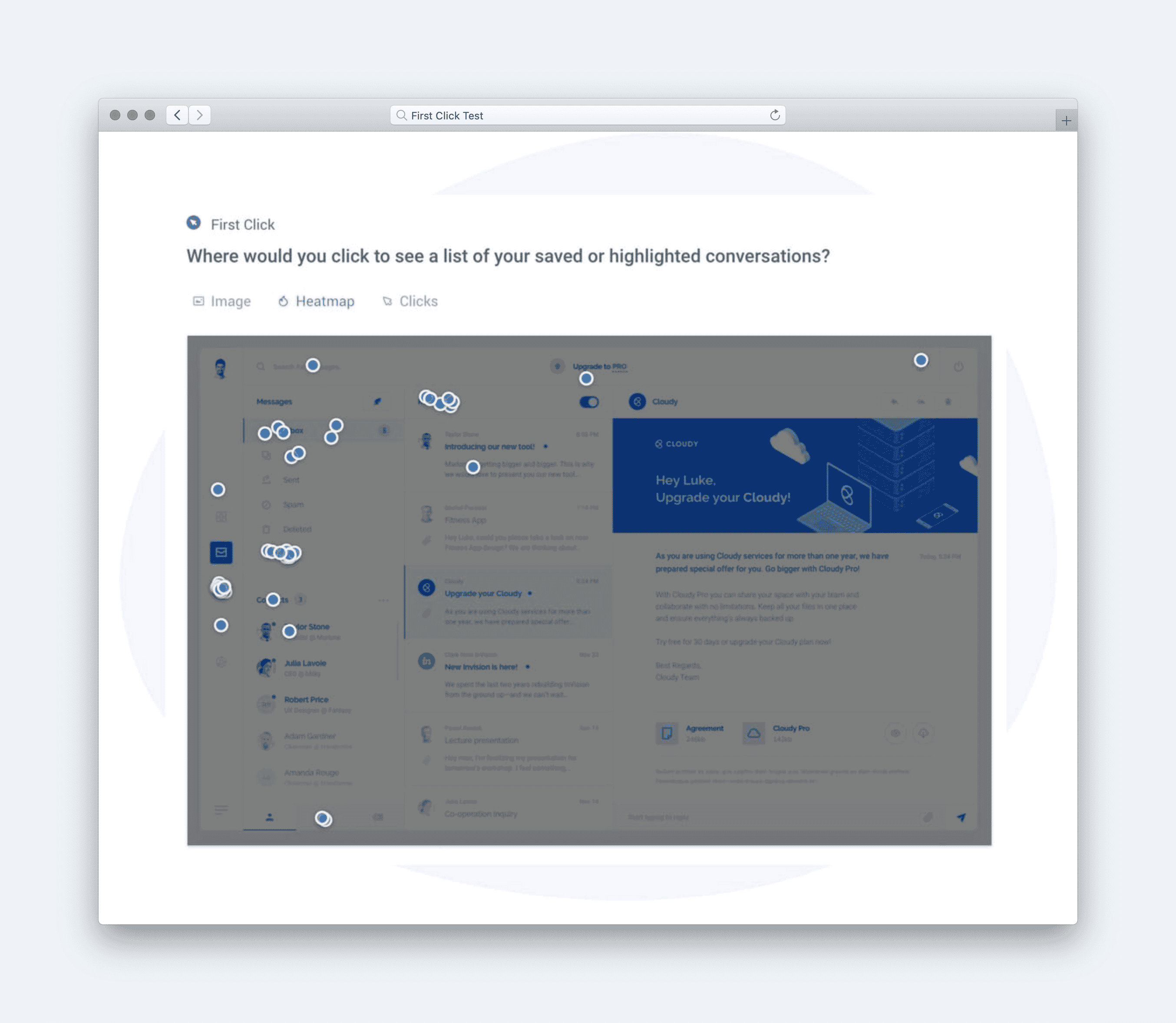
- Usability **(Average success across multiple click directives)**
Question type: Multi-task click test. Example: “Where would you click to filter for travel rewards cards?” followed by “Where would you click to sort by lowest APR?” (Success rate is averaged across tasks)
[Image]
Calculate UX Metric Scores from User Feedback
For NerdWallet’s credit card comparison filters, user feedback was analyzed to assess how effectively the interface helps people refine their search results and make informed product decisions. The design stack for this test included metrics that measure how intuitively users can interact with filters, how efficiently they reach relevant results, and how positively they feel about the overall experience. Each score was calculated on a 0–100% scale using the following benchmarks:
-
Very Good = 90% and above
-
Good = 70%–89%
-
Average = 50%–69%
-
Poor = 30%–49%
-
Very Poor = below 30%
Once the individual UX metric scores are calculated, the average of those scores are used to determine the overall score for the user experience.
NerdWallet’s Results
-
Usability (74% — Good): Most participants found the filtering system easy to use and logically organized. The labels and filter categories were clear, though some users suggested highlighting selected filters more distinctly to make applied options stand out.
-
Effort (90% — Very Good): The filtering and sorting interactions required minimal effort. Users appreciated how changes updated results quickly without reloading, creating a smooth and efficient browsing experience.
-
Satisfaction (90% — Very Good): Participants expressed high satisfaction, noting that the design “feels professional and easy to trust.” The streamlined workflow helped them feel confident they were seeing accurate and relevant results.
[Image]
These results produced an overall test score of 85% — Good, indicating that NerdWallet’s filter and sort interface delivers strong usability and efficiency. The interaction design supports fast decision-making, though emphasizing visual feedback (such as active filter states or summary chips) could further enhance clarity and user control.
Click here to check out the raw survey data and UX for Nerdwallet’s credit card search filters.
Draw Signals from Your Design Stack
Here’s how signals were surfaced from the Nerdwallet filters test results by following these five steps:
1. Focus on poorly scoring metrics
[Image]
Nerdwallet’s filters and sort experience earned an overall score of 85%, with Usability at 74% (Good) and Effort and Satisfaction both Very Good (90%). While users found the interaction smooth and rewarding once they began filtering, the lower usability score suggests initial confusion or mild friction when first engaging with controls. The key signal: strong performance after discovery, but minor friction upfront.
2. Identify patterns across metrics
[Image]
The combination of high satisfaction and effort scores reveals that users feel rewarded by the process once filters are applied — the UI delivers relevant results quickly and efficiently. However, the usability gap indicates an early hesitation: users likely take a moment to interpret how filters work or where to start. This pattern is common in dense financial UIs, where clarity competes with content richness.
3. Determine if user needs are being met
[Image]
-
Findable: Partially met — filter categories could stand out more visually to guide first-time users.
-
Usable: Partially met — controls are functional but not immediately intuitive to all users.
-
Efficient: Exceeded — results update quickly with minimal delay.
-
Valuable: Met — results feel relevant and personalized once refined.
-
Insightful: Met — filter effects are clear, helping users see how their choices shape results.
4. Compare outcomes to your business goals
-
Increase Product Discovery: Achieved — filters help users explore relevant credit card options effectively.
-
Boost Conversion Rates: Supported — refined results make partner offers more visible and actionable.
-
Enhance User Satisfaction: Achieved — smooth feedback and responsive filtering build confidence.
-
Reduce Drop-Off Rates: Achieved — users stay engaged due to fast updates and visible results.
-
Collect Behavioral Insights: Supported — user interactions provide clear data on high-interest filters.
5. Surface signals & establish a direction
**
Signals derived from the data:**
-
High satisfaction but uneven first impressions — users enjoy the experience once engaged but hesitate initially.
-
Strong efficiency and feedback loops — performance and clarity after selection drive user trust.
-
Minor usability friction at entry points — labels or hierarchy could be refined for faster comprehension.
Direction based on business context:
To meet Nerdwallet’s goals of increasing discovery and conversions, next steps should focus on:
-
Making primary filters more visually distinct (e.g., bold category headers or subtle animation cues).
-
Adding quick-start prompts (“Show me the best cards for travel” or “Sort by cashback rate”).
-
Providing contextual microcopy explaining what each filter affects (“Adjusts top card matches by APR”).
Based on the signals and design direction, we created an updated version of the design with the expected UX metric improvement:
[Image]
The signal is clear: Nerdwallet’s filtering system feels fast and satisfying—refining the first interaction can make it instantly intuitive.