[Image]
This experience supports a moment where shoppers are weighing tradeoffs before committing to a purchase. People are trying to understand how one product stacks up against close alternatives without losing their place or momentum. For the business, this moment matters because confident comparison keeps shoppers engaged and moving forward instead of drifting to competitors.
We tested Walmart’s product detail page with an embedded product comparison table. Participants were asked to imagine shopping for a laptop and evaluate the content, clarity, and usefulness of the comparison experience. The test used Satisfaction, Success, and Usefulness metrics to understand how easily people could find comparison tools, how they felt about the information presented, and whether the experience supported real decision-making.
Comparison moments often reveal subtle breakdowns that don’t show up in simple conversion data—hesitation, overload, or quiet uncertainty. This type of testing surfaces where people slow down, what reassures them, and where clarity starts to thin. For teams, these signals help guide better decisions about how much information to show, how to structure it, and how to support confidence at a critical point in the buying journey.
Define Goals for Your Product Comparison Tables
An eCommerce product comparison table should balance user needs like clarity, confidence, and control with business goals such as informed conversion, reduced hesitation, and higher purchase satisfaction. Users want help making a smart decision without opening ten tabs, while businesses want shoppers to feel confident choosing the right product and moving forward. When comparison works, it replaces doubt with direction.
**Audience:**
This concept was tested with young and middle-aged online shoppers in the United States who used eBay’s laptop comparison table. Participants were asked to compare multiple products, assess differences, and decide which option felt like the best fit for their needs and budget.
User Needs
At this stage, users are weighing trade-offs and trying to avoid regret. The experience should support clear thinking.
-
Differences between products should be easy to understand at a glance (insightful).
-
The table should be simple to scan, with consistent structure and labels (usable).
-
Users should be able to compare key attributes without excessive scrolling or effort (efficient).
-
The information shown should help users feel confident they’re making a good choice (valuable).
-
Users should feel in control of the decision, not nudged or overwhelmed (empowering).
Together, these needs ensure comparison feels like support—not pressure—at a critical decision point.
Business Goals
From the business perspective, comparison tables are about reducing friction at the moment of choice.
-
Increase Confident Conversions – Help shoppers commit by clearly showing differences and trade-offs.
-
Reduce Decision Paralysis – Minimize hesitation caused by too many similar options.
-
Improve Purchase Satisfaction – Set clearer expectations to reduce returns or regret.
-
Guide Shoppers to the Right Fit – Help users self-select products that meet their needs and price range.
-
Learn What Drives Decisions – Capture signals about which attributes matter most to shoppers.
When these goals are aligned, product comparison becomes a trust-building tool—helping users choose with confidence and businesses earn it.
Choose Metrics to Test Your Product Comparison Table
This experience tests how shoppers compare similar products and decide whether to move forward. A focused design stack of UX metrics was selected by mapping core user needs to signals we could observe in behavior and response patterns. For this test, the metrics used were Success, Satisfaction, and Usefulness.
Findable → Success In this moment, shoppers want to quickly locate where and how to compare products. If they can’t find the comparison option right away, the experience breaks before it begins. The Success metric captures whether people can immediately identify and act on the comparison affordance, signaling whether the experience supports fast orientation and momentum.
Useful → Usefulness Shoppers are trying to decide if the information in front of them is enough to make a choice. They want specs that feel relevant, complete, and decision-ready—not just technically accurate. The Usefulness metric reflects whether the comparison content actually helps people evaluate tradeoffs and move closer to a purchase decision.
Credible → Satisfaction At this stage, trust is built through transparency. Shoppers are looking for clear, side-by-side information that feels honest and unbiased. Satisfaction captures the emotional response to that clarity—whether the comparison experience feels reassuring and supportive, or overwhelming and effortful.
Establish Hunches to Direct Your Testing
Before testing, the team started with a few open questions about how people might experience product comparison in a high-information moment. These hunches helped narrow uncertainty and shape questions that could reveal where confidence builds—or quietly breaks—during comparison. The goal was to understand what helps shoppers move forward and what causes them to pause.
Example: Walmart Product Comparison Tables
<table xmlns="http://www.w3.org/1999/xhtml" style="min-width: 75px;"><colgroup><col style="min-width: 25px;"><col style="min-width: 25px;"><col style="min-width: 25px;"></colgroup><tbody><tr><th colspan="1" rowspan="1"><p>Hunches</p></th><th colspan="1" rowspan="1"><p>Questions</p></th><th colspan="1" rowspan="1"><p>UX Metric</p></th></tr><tr><td colspan="1" rowspan="1"><p>Shoppers will notice the comparison table quickly, but may feel momentarily overwhelmed by the amount of information presented at once. Dense specs could slow scanning even if the content is relevant.</p></td><td colspan="1" rowspan="1"><p>How do you feel about the information provided in this comparison table?</p></td><td colspan="1" rowspan="1"><p>Satisfaction</p></td></tr><tr><td colspan="1" rowspan="1"><p>If the comparison option is clearly visible, most shoppers will know exactly where to click to compare similar products.</p></td><td colspan="1" rowspan="1"><p>Click where you would go to see how other laptop computers compare to this one.</p></td><td colspan="1" rowspan="1"><p>Success</p></td></tr><tr><td colspan="1" rowspan="1"><p>Seeing multiple products side by side will help shoppers feel more confident that they understand the differences between options.</p></td><td colspan="1" rowspan="1"><p>How do you feel about the content you see on this page?</p></td><td colspan="1" rowspan="1"><p>Satisfaction</p></td></tr><tr><td colspan="1" rowspan="1"><p>Even with strong comparison content, some shoppers may still question whether the information fully supports their specific needs.</p></td><td colspan="1" rowspan="1"><p>How much do you agree with the following statement? “The website’s features meet my needs.</p></td><td colspan="1" rowspan="1"><p>Usefulness</p></td></tr><tr><td colspan="1" rowspan="1"><p>If the page is well structured, shoppers will perceive the experience as easy to use, even during a complex comparison task.</p></td><td colspan="1" rowspan="1"><p>How much do you agree with the following statement? “The website is easy to use.”</p></td><td colspan="1" rowspan="1"><p>Usefulness</p></td></tr></tbody></table>
Together, these hunches aimed to evaluate how well the comparison experience balances understanding, confidence, and forward momentum at a critical decision point.
Turn Hunches into Test Questions
Turning hunches into concrete questions ensures the team is testing real moments of understanding, hesitation, and decision-making. Pairing each UX metric with a specific question type helps translate abstract risk into observable signals that can be measured consistently.
-
Satisfaction (Impression Rating)
Question type: Multiple-choice impressions
Example: How do you feel about the content you see on this page?This question captures the participant’s immediate emotional response to the overall product page, signaling whether the experience feels supportive or overwhelming at first glance.
[Image]
-
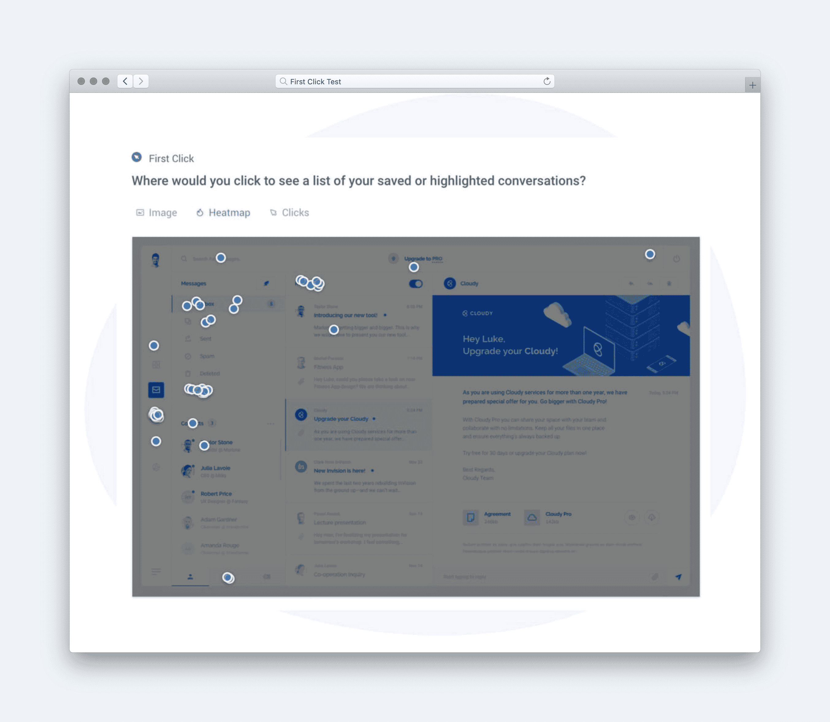
Success (First-Click Test)
Question type: First-click test
Example: Click where you would go to see how other laptop computers compare to this one.This question measures whether the comparison affordance is obvious without instruction, revealing how quickly shoppers can orient and take action.
[Image]
-
Satisfaction (Impression Rating)
Question type: Multiple-choice impressions
Example: How did you feel about the information provided in this comparison table?This isolates sentiment toward the comparison table itself, separating reactions to dense information from reactions to the page as a whole.
[Image]
-
Usefulness (Agreement Scale)
Question type: Likert scale
Example: How much do you agree with the following statement: “The website is easy to use.”This question tests whether the structure and layout support ease of use during a cognitively demanding comparison task.
[Image]
Calculate UX Metric Scores from User Feedback
This test examined how shoppers compare similar products using a comparison table embedded on Walmart’s product detail page. Participants were asked to imagine shopping for a laptop and evaluate how easy it was to compare options and decide. The design stack combined Success, Satisfaction, and Usefulness, blending behavioral signals with attitudinal feedback to capture both action and confidence.
-
Very Good = 90% and above
-
Good = 70%–89%
-
Average = 50%–69%
-
Poor = 30%–49%
-
Very Poor = below 30%
The overall test score was 82% (Good). At a high level, this score reflects a comparison experience that works reliably for most shoppers, supporting confident evaluation with only minor strain during interpretation.
**Success (88% — Good):**
Most participants immediately knew where to click to compare similar products. This indicates strong visibility and clear affordances at the moment shoppers look for alternatives. Very little hesitation appeared at the point of action.
**Satisfaction (78% — Good):**
Overall sentiment toward the page content was positive, with users responding well to the availability of comparison information. Some hesitation emerged around information density, suggesting moments where scanning slowed even though intent remained intact.
**Satisfaction (83% — Good):** Reactions to the comparison table itself were more positive once users engaged with it. Participants felt reassured by side-by-side specs and options, reinforcing confidence during evaluation.
**Usefulness (79% — Good):**
Users generally agreed that the site was easy to use during comparison. The structure supported decision-making, though the volume of information required more effort to prioritize.
[Image]
Taken together, the scores point to a strong, trustworthy comparison experience that helps shoppers evaluate options without friction at the interaction level. The primary tension is not access or clarity, but the cognitive effort required to process dense information at a critical decision moment. Overall, the experience supports confident comparison while revealing small pauses where momentum can thin.
Click here to check out the raw survey data and UX metric scores for eBay’s product comparison table.
Draw Signals from Your Design Stack
1. Focus on poorly scoring metrics
[Image]
eBay’s product comparison table earned an overall score of 82% (Good), with Success (88%), Usefulness (79%), and Satisfaction (78–83%) all performing well. While no metric fell into the Poor range, the lowest relative signal came from Usefulness, indicating that while users can complete comparisons successfully, the table does not always surface the most decision-critical differences at a glance. The key signal: the experience works functionally, but could do more to guide confident decision-making.
2. Use design intuition to identify patterns across metrics
[Image]
The pattern shows a strong baseline of clarity and structure — users understand how to use the table and are able to compare products without friction. However, the usefulness score suggests that not all rows feel equally meaningful. Users likely scan many attributes that feel similar or low-impact, while key differentiators (performance, value trade-offs, or use-case fit) are not emphasized enough. This reflects a common comparison UX challenge: completeness over prioritization.
3. Determine if user needs are being met
[Image]
Insightful: Met — differences are visible, but not always immediately meaningful. Usable: Exceeded — layout, labels, and structure are easy to scan and understand. Efficient: Exceeded — users can compare without excessive scrolling or effort. Valuable: Met — information helps decision-making, but could feel more confidence-building. Empowering: Met — users feel in control, though guidance is minimal.
4. Compare outcomes to your business goals
Increase Confident Conversions: Partially achieved — users can compare, but may still hesitate.
Reduce Decision Paralysis: Supported — structure helps, but attribute overload remains.
Improve Purchase Satisfaction: Supported — clear expectations reduce regret risk.
Guide Shoppers to the Right Fit: Partially achieved — table shows differences but doesn’t recommend.
Learn What Drives Decisions: Supported — interaction data can reveal attribute importance.
5. Surface signals & establish a direction
Signals derived from the data:
-
The comparison table succeeds at clarity and usability but underperforms as a decision accelerator.
-
Users can complete the task, yet may still struggle to identify why one option is better for them.
-
Attribute equality creates visual noise, reducing perceived usefulness.
**Direction based on business context:
**To strengthen confidence and reduce hesitation at this critical decision point, next steps should include:
[Image]
-
Highlighting “most different” or “most important” attributes visually.
-
Grouping specs by user value (performance, portability, value) instead of raw categories.
-
Adding lightweight guidance like “Best for students” or “Best performance per dollar.”
-
Allowing users to toggle or pin attributes that matter most to them.
The signal is clear: eBay’s comparison tables make differences visible — making them meaningful is the next opportunity to drive confident conversion.