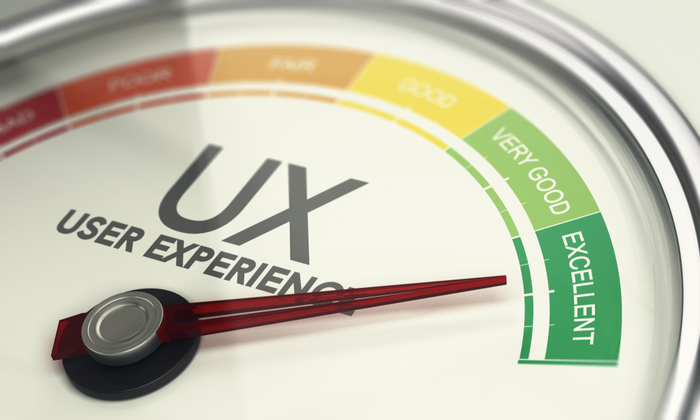
If users can’t find it, they can’t use it.
Findability is the hidden first step, the quiet test every product fails before a click, tap, or scroll even happens. When people have to search too hard, frustration grows fast. The best designs don’t just look good; they guide people where they need to go, almost without thinking.
A findable experience removes confusion and builds confidence. It’s what turns a messy system into a clear journey, one where the next step is always obvious, and the goal feels within reach.
This page shows how to evaluate findability, measure it with real UX metrics, and fix it before small frustrations become lost users.
How to Use This Page
Use the Findability Heuristics to evaluate how easily users can locate information or features in your product.
-
Select a key page, flow, or interaction.
-
Review each heuristic below and its supporting metrics.
-
Observe where users hesitate, search, or repeat actions.
-
Capture supporting UX metrics through testing or analytics.
-
Prioritize fixes based on the patterns you find, start where effort is high or comprehension is low.
Where This Fits in Glare
Findability belongs to the Define phase of the Glare framework. It represents the foundation of user understanding, how easily people locate what matters, before usability or desirability testing begins.
Strong findability reduces friction, improves comprehension, and sets the stage for higher completion and satisfaction scores across the journey.
Why Findable Experiences Matter
A findable experience can:
-
Reduce frustration and wasted time.
-
Improve user confidence in the system.
-
Increase efficiency by making information accessible.
-
Enhance overall usability and satisfaction.
By focusing on findability, teams ensure users spend less time searching and more time engaging.
Common UX Metrics for Findable Experiences
Behavioral Metrics (User Actions)
-
Comprehension, Measures how well users understand where to find information.
-
Completion Rate, Tracks whether users successfully locate and complete tasks.
-
Success Rate, Measures how often users reach their intended goal.
-
Usability, Assesses how easy it is to navigate the system.
Findability Heuristics
Findability Heuristics help teams design experiences where users can quickly locate what they need without confusion or wasted effort. They translate the principles of clear structure, consistent navigation, and meaningful feedback into practical rules for design.
When applied together, these heuristics ensure that information, tools, and actions are easy to spot, understand, and reach. A findable product doesn’t make people think about where to look next, it guides them naturally, reduces friction, and builds confidence in every step of the journey.
1. Clear Pathways
Users should always see where to go next.
A clear path gives people confidence. When steps or links are hidden, users hesitate or stop. Every interaction should show a next move that feels natural.
**Tips:
**• Use clear, descriptive CTAs that set expectations.
• Keep the navigation visible and easy to reach.
• Avoid dead ends; every page should offer a way forward or back.
Example: An e-commerce product page includes “Add to Cart” and “Continue Shopping” buttons below the product details, ensuring the next action is obvious.
**Metrics:
**• Completion Rate – Are users finishing their intended journeys?
• Success Rate – Do they reach the goal without backtracking?
• Effort – How many clicks or steps does it take to move forward?
2. Logical Structure
Information should be grouped and ordered the way users think.
People rely on patterns and logic to make sense of what they see. When the structure mirrors their mental model, navigation feels effortless.
**Tips:
**• Organize menus and content by user goals, not internal teams.
• Use headings and categories that reflect common tasks or needs.
• Limit layers of navigation to keep paths short and simple.
Example: A bank site groups “Credit Cards,” “Loans,” and “Accounts” under “Products,” reflecting how users naturally explore financial services.
**Metrics:
**• Comprehension – Do users understand where to find things?
• Time on Task – How long does it take to locate information?
• Error Rate – How often do users choose the wrong path?
3. Reliable Search
Search should help users find what they mean, not just what they type.
Search is often the fastest route for users, but only if it understands their intent. Poor search increases frustration and abandonment.
**Tips:
**• Use autocomplete and spelling correction to guide queries.
• Offer filters and sorting to refine large result sets.
• Highlight keywords in results to show relevance.
Example: A travel site’s search field suggests “Flights to Paris” as a user types “Pa…,” showing intent recognition and saving time.
**Metrics:
**• Search Success Rate – Are users finding what they look for?
• Search Refinement Rate – Do they need to rephrase or filter?
• Bounce Rate – Do they leave after failed searches?
4. Consistent Locations
Keep navigation and key links in familiar, fixed places.
Users rely on consistency to move quickly. When elements shift or change location, they have to relearn where things are, increasing cognitive load.
**Tips:
**• Place navigation and key controls in predictable positions across screens.
• Use consistent wording for similar actions.
• Avoid redesigning core menus unless data shows confusion.
Example: A news site keeps its search bar and main sections in the same header across desktop and mobile versions.
**Metrics:
**• Task Success – Are users completing repeat actions faster?
• Session Duration – Do they spend less time reorienting?
• Frequency of Navigation Errors – Are users misclicking or restarting tasks?
5. Visual Cues That Guide
Visual hierarchy should point users toward what matters most.
People scan before they read. Hierarchy, color, and spacing should make important content stand out so users instantly see where to focus.
**Tips:
**• Use size and color to emphasize priority actions.
• Limit competing visual elements.
• Test with users to ensure they notice key information first.
Example: A form highlights the “Submit Application” button with a distinct color and space, guiding users naturally to completion.
**Metrics:
**• First-Click Success – Do users click the right element first?
• Eye-Tracking or Attention Metrics – Are visual cues noticed quickly?
• Satisfaction – Do users report that the interface feels clear and direct?
6. Plain Language Labels
Use words your users understand.
Clarity in language removes friction. When users see familiar words, they recognize meaning faster and feel more in control.
**Tips:
**• Base labels on user vocabulary found in research or analytics.
• Avoid internal terms, abbreviations, or jargon.
• Keep labels short and action-oriented.
Example: A SaaS dashboard uses “Download Report” instead of “Generate Data Output,” matching user language.
**Metrics:
**• Comprehension – Do users understand what a link or button means?
• Error Rate – Are users choosing incorrect actions due to unclear wording?
• Reaction – Do they feel confident and informed while navigating?
7. Predictable Interactions
Every action should behave the way users expect.
Predictability creates trust. When clicking a link or opening a menu leads somewhere unexpected, users lose confidence in the interface.
**Tips:
**• Match actions to clear outcomes.
• Keep animation and transitions consistent across the product.
• Preview what will happen when users hover or tap.
Example: A “Save Draft” button always stores progress without submitting, ensuring consistent expectations.
**Metrics:
**• Task Success – Do expected actions lead to expected results?
• Effort – How often do users need to retry or correct mistakes?
• Trust – Do users feel confident performing repeated actions?
8. Feedback for Orientation
Always show users where they are and how to return.
Orientation helps users feel grounded. Without clear feedback, they can’t tell if they’re making progress or wandering off course.
**Tips:
**• Use breadcrumbs, progress bars, or active menu highlights.
• Show confirmation after each completed step.
• Let users retrace steps without losing progress.
Example: A checkout flow uses a progress bar (“Shipping → Payment → Review”) to remind users where they are in the process.
**Metrics:
**• Completion Rate – Are users following multi-step processes successfully?
• Abandonment Rate – Do they drop off mid-flow?
• Satisfaction – Do they report feeling “in control” and aware of progress?
9. Easy Recovery
Users should be able to backtrack without starting over.
Mistakes happen. A forgiving system keeps users from feeling stuck or forced to restart.
**Tips:
**• Offer undo, “Back to results,” or “Previous step” options.
• Keep entered information when users navigate back.
• Provide shortcuts to common recovery paths.
Example: A job portal keeps filters applied after returning from a job listing so users can continue browsing without repeating their search.
**Metrics:
**• Error Recovery Rate – How easily do users fix mistakes?
• Task Completion Time – Do they return to flow quickly?
• Sentiment – Do users describe the experience as forgiving or intuitive?
**
Summary Insight**
When users know where to go, everything else improves: confidence, completion, satisfaction. Clarity drives momentum. Confusion kills it.
Strong findability means less searching and more doing. Track comprehension, success, and effort. Watch where people hesitate or repeat steps. Then remove every roadblock until your design feels invisible — because the moment users stop thinking about where to click, you’ve already won.
What to Do Next
Run a quick navigation test or tree study on your most visited page. See where users hesitate and where they succeed.
Then move to the next Glare facet, Measure, to test usefulness and prove that what’s findable also works.
Resources
'Findability' is crucial; if users cannot locate information or features, they cannot utilize them, rendering other design aspects ineffective. Therefore, ensuring that content is easily discoverable is a fundamental component of a successful user experience.
https://medium.com/design-bootcamp/findable-the-third-dimension-of-user-experience-59f4b9533dd1 by Vishal Mehta
Findability measures how easily users can locate known content on a website, both through external search engines and internal navigation. This is essential for ensuring users can efficiently access what they need while also encountering helpful new information along the way.
https://baymard.com/learn/findability-vs-discoverability-ux by Christian Holst