[Image]
This experience sits at the front door of an eCommerce brand. It’s where shoppers arrive to get oriented, decide if they trust what they’re seeing, and choose where to begin. The business goal is simple but high-stakes: turn first impressions into confident exploration without losing people to hesitation or overload.
We tested the desktop homepages for Athleta, Fabletics, and lululemon, asking users to imagine they were shopping for athletic apparel and interact with each page naturally. The test used Engagement, Comprehension, Appeal, Sentiment, and Loyalty to observe where users clicked first, how clearly they understood the offering, and how the experience made them feel in those opening moments.
Homepage testing surfaces a specific kind of breakdown that’s easy to miss in analytics alone: the gap between understanding and action. These signals help teams see when a page is clear but passive, energetic but overwhelming, or visually strong yet indecisive. For product leaders and designers, this kind of insight reduces guesswork and supports better decisions at the moment where momentum is either created or lost.
Define Goals for Your Homepage Comparison
An eCommerce homepage comparison should balance user needs like trust, clarity, and emotional pull with business goals such as differentiation, engagement, and conversion readiness. Users are forming fast judgments about what each brand stands for and whether it fits them. Businesses want those first impressions to clearly signal value and set the tone for deeper exploration. When homepages work, users don’t hesitate—they lean in.
**Audience:**
This concept was tested with women and younger online shoppers in the United States who reviewed and compared the homepages of Athleta, Fabletics, and Lululemon. Participants were asked to share how each homepage made them feel, what they understood about the brand, and which experience they were most likely to continue exploring.
User Needs
At this moment, users are scanning for identity fit and clarity, not details. The experience should support quick sense-making.
-
The brand should feel trustworthy and aligned with its promises at first glance (credible).
-
The visual style and messaging should feel appealing and emotionally relevant (desirable).
-
The homepage should clearly communicate what the brand offers and who it’s for (insightful).
-
The experience should pull users in and make them want to keep browsing (engaging).
-
The value of the brand—products, lifestyle, or benefits—should be easy to grasp quickly (valuable).
Together, these needs ensure the homepage feels confident and intentional, helping users decide whether the brand is worth their time.
Business Goals
From the business side, homepage comparisons reveal where positioning actually lands.
-
Clarify Brand Differentiation – Understand how clearly each brand stands apart in tone, focus, and promise.
-
Increase Engagement Depth – Encourage users to move beyond the homepage into product and category pages.
-
Improve First-Impression Conversion – Reduce bounce by aligning messaging with audience expectations.
-
Strengthen Brand Affinity – Build early emotional connection that supports loyalty over time.
-
Identify Competitive Gaps – Learn where competitors communicate value more clearly or compellingly.
When these goals are aligned, homepage design becomes a strategic advantage—setting clear expectations, attracting the right audience, and guiding users into confident exploration instead of uncertainty.
Choose Metrics to Test Your Homepage Comparison
This concept tested the homepage experience for athletic apparel brands, where first impressions need to turn quickly into confident action. We selected a design stack of UX metrics by mapping core user needs to signals that show how people orient, decide, and feel in the first moments of arrival. The metrics used were Engagement, Comprehension, Appeal, Sentiment, and Loyalty.
Findable → Engagement When users land on a homepage, their first question is often unspoken: Where do I start? Engagement captures whether people can quickly identify a clear entry point and act without hesitation. The first click shows if the page offers direction or leaves users scanning without momentum.
Useful → Comprehension Shoppers need to understand what the brand offers and whether it’s relevant to them. Comprehension reflects how clearly the homepage communicates the product range, positioning, and purpose at a glance. This metric captures whether understanding is immediate or requires extra effort to piece together.
Desirable → Appeal Visual design plays a large role in shaping first impressions for apparel brands. Appeal reflects whether the look and feel draw people in or quietly turn them away. It captures emotional response to imagery, layout, and overall presentation in those first few seconds.
Credible → Sentiment Beyond liking the design, users are forming a judgment about trust and tone. Sentiment captures whether the experience feels confident, overwhelming, calm, sales-driven, or balanced. This metric reflects how brand choices influence emotional comfort and confidence.
Valuable → Loyalty Loyalty looks past the immediate interaction to gauge longer-term impact. It captures whether the experience leaves users feeling positive enough to recommend or return. This signal helps connect first impressions to brand strength beyond a single visit.
Establish Hunches to Direct Your Testing
Before testing, the team had a few open questions about how these homepages might help—or hinder—shoppers in their first moments. These hunches reflect real uncertainty teams face when balancing brand, promotion, and clarity. The goal was to turn those uncertainties into focused questions that could be tested directly.
Example: Athleta, Fabletics, and lululemon
<table xmlns="http://www.w3.org/1999/xhtml" style="min-width: 75px;"><colgroup><col style="min-width: 25px;"><col style="min-width: 25px;"><col style="min-width: 25px;"></colgroup><tbody><tr><th colspan="1" rowspan="1"><p>Hunches</p></th><th colspan="1" rowspan="1"><p>Questions</p></th><th colspan="1" rowspan="1"><p>UX Metric</p></th></tr><tr><td colspan="1" rowspan="1"><p>Strong brand imagery and lifestyle messaging may feel inspiring, but could make it harder for users to identify where to begin shopping.</p></td><td colspan="1" rowspan="1"><p>Where would you click first on this page?</p></td><td colspan="1" rowspan="1"><p>Engagement</p></td></tr><tr><td colspan="1" rowspan="1"><p>Clear product categories and familiar brand signals may help users quickly understand what the company offers, regardless of visual style.</p></td><td colspan="1" rowspan="1"><p>How well do you understand what this company is offering?</p></td><td colspan="1" rowspan="1"><p>Comprehension</p></td></tr><tr><td colspan="1" rowspan="1"><p>Highly polished visuals may increase positive reactions, even if users aren’t yet sure what action to take.</p></td><td colspan="1" rowspan="1"><p>How do you feel about the look of this page?</p></td><td colspan="1" rowspan="1"><p>Appeal</p></td></tr><tr><td colspan="1" rowspan="1"><p>Heavy promotional messaging might drive urgency but could also create skepticism or emotional fatigue.</p></td><td colspan="1" rowspan="1"><p>What impressions does this site give you?</p></td><td colspan="1" rowspan="1"><p>Sentiment</p></td></tr><tr><td colspan="1" rowspan="1"><p>A strong first impression does not always translate into long-term advocacy or recommendation.</p></td><td colspan="1" rowspan="1"><p>How likely are you to recommend this website to a friend or colleague?</p></td><td colspan="1" rowspan="1"><p>Loyalty</p></td></tr></tbody></table>
Turn Hunches into Test Questions
Turning hunches into concrete questions makes uncertainty measurable. Pairing each UX metric with a specific question type ensures we capture clear signals about where users hesitate, feel confident, or move forward without overthinking.
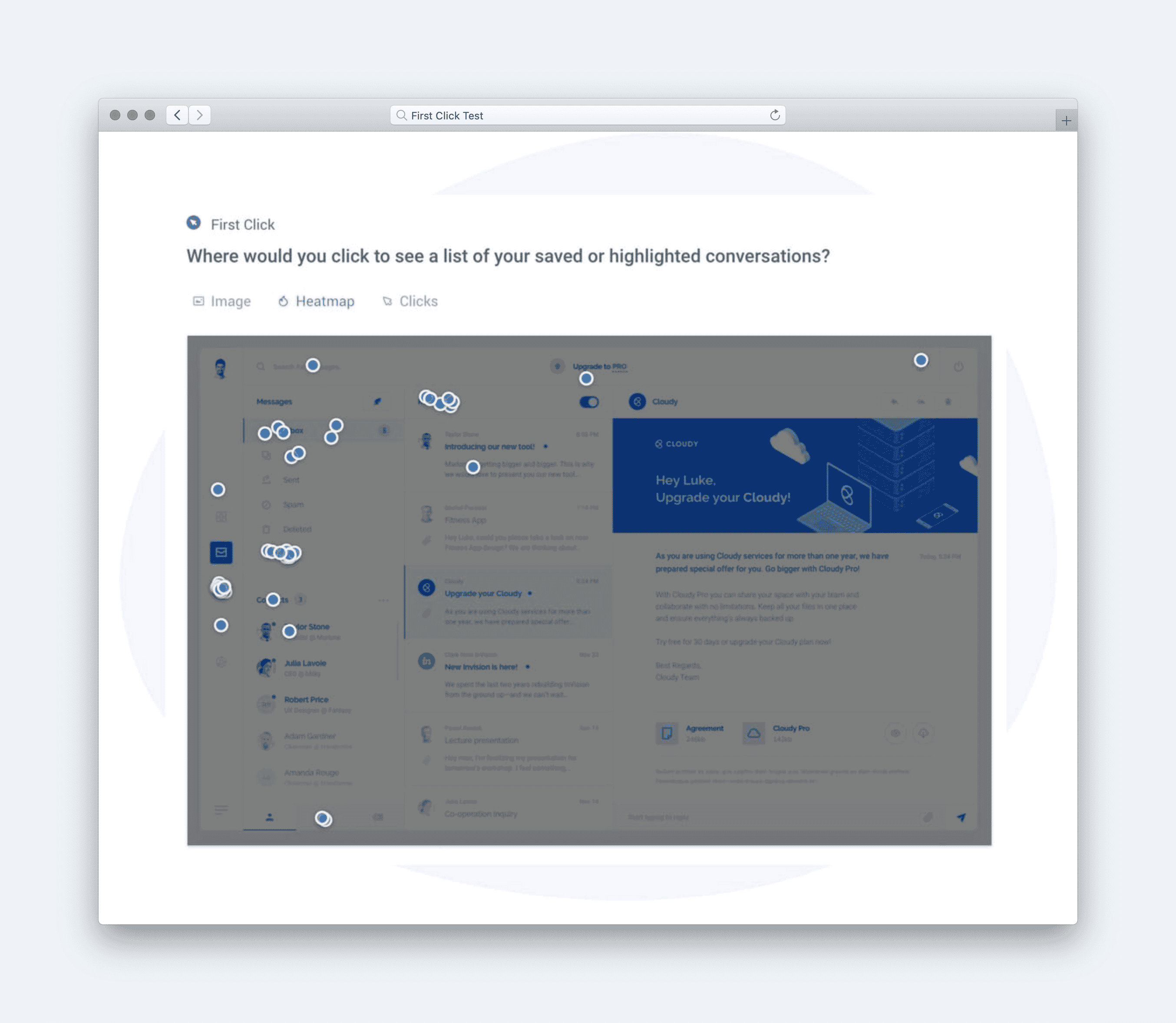
- **Engagement (First-click test)**
Question type: First-click test
Example: “Click where you would go first on this page.”
[Image]
- **Comprehension (Likert scale)**
Question type: Likert scale
Example: “How well do you understand what this company is offering?”
[Image]
- **Appeal (Likert scale)**
Question type: Likert scale
Example: “How do you feel about the look of this page?”
[Image]
- **Sentiment (Multiple-choice impressions)**
Question type: Multiple-choice impressions
Example: “What impressions does this site give you? Select all that apply.”
[Image]
- **Loyalty (Likelihood to recommend)**
Question type: Likelihood to recommend
Example: “How likely are you to recommend this website to a friend or colleague?” (Scale: Not at all likely → Extremely likely)
[Image]
Calculate UX Metric Scores from User Feedback
This concept examined how shoppers experience and interpret athletic apparel homepages at the moment of arrival. Users were asked to imagine they were shopping and respond based on what they noticed, understood, and felt in those first few seconds. The design stack included Engagement, Comprehension, Appeal, Sentiment, and Loyalty, combining behavioral signals with attitudinal response.
-
Very Good = 90% and above
-
Good = 70%–89%
-
Average = 50%–69%
-
Poor = 30%–49%
-
Very Poor = below 30%
[Image]
Across all three brands, the data shows a shared pattern: understanding and visual appeal are not the problem. The tension sits between emotion and momentum—whether users feel pushed too hard, or not guided enough, when deciding what to do first. These scores describe three competent homepage experiences, each revealing a different way confidence can either accelerate action or quietly stall it.
Click here to check out the raw survey data and UX metric scores for these competitor’s homepage experience:
Draw Signals from Your Design Stack
1. Focus on poorly scoring metrics
[Image]
Across the three homepages, overall scores landed in the Good range, with Athleta at 77%, and both Lululemon and Fabletics at 70%. While Comprehension consistently scored very high (91% across all three), Engagement and Loyalty were the weakest metrics—most notably Engagement for Lululemon (44%) and Sentiment for Fabletics (35%). These dips suggest that while users quickly understand what each brand offers, not all homepages succeed at emotionally pulling users in or motivating them to stay, explore, and return. The key signal: clarity is strong across the category, but emotional connection and long-term brand pull vary significantly.
2. Use design intuition to identify patterns across metrics
[Image]
A clear pattern emerges when comparing brands side-by-side. Athleta balances clarity with warmth, resulting in strong Sentiment (96%) and Appeal (88%), but only moderate Engagement (50%), suggesting users feel good about the brand without feeling compelled to act immediately. Lululemon’s homepage communicates brand and product well, but low Engagement indicates the experience may feel visually static or emotionally distant at first glance. Fabletics, by contrast, drives high Engagement (87%) but suffers in Sentiment, implying that aggressive promotions or messaging tactics may spark attention while eroding trust or emotional comfort.
3. Determine if user needs are being met
[Image]
-
Credible: Met across all brands — users trust the brands and understand their positioning.
-
Insightful: Exceeded — messaging clearly communicates what each brand offers and who it’s for.
-
Desirable: Partially met — visual appeal is strong, but emotional resonance varies by brand.
-
Engaging: Partially met — only Fabletics strongly drives interaction, while others feel passive.
-
Valuable: Met — users understand the value proposition, though it doesn’t always feel compelling enough to explore further.
4. Compare outcomes to your business goals
-
Clarify Brand Differentiation: Achieved — users can clearly tell the brands apart in tone and promise.
-
Increase Engagement Depth: Partially achieved — strong comprehension doesn’t consistently translate into action.
-
Improve First-Impression Conversion: Supported — clarity reduces confusion, but emotional hooks are uneven.
-
Strengthen Brand Affinity: Mixed — Athleta excels here, Fabletics struggles, Lululemon sits in between.
-
Identify Competitive Gaps: Fully achieved — contrasts in engagement and sentiment reveal clear opportunities.
5. Surface signals & establish a direction
Signals derived from the data:
-
Clear messaging is table stakes; it no longer differentiates premium eCommerce brands.
-
Emotional tone and restraint matter—high engagement without trust damages sentiment.
-
Strong sentiment without momentum risks passive browsing rather than action.
**Direction based on business context:**
To strengthen homepage performance across the category, next steps should include:
[Image]
-
Introducing clearer emotional hooks above the fold (storytelling, human moments, or purpose-led cues).
-
Balancing promotional urgency with trust-building language and visual calm.
-
Testing homepage variations that prioritize one clear next action instead of broad inspiration alone.
The signal is clear: Today’s best eCommerce homepages succeed by pairing instant clarity with emotional pull—brands that balance both create confidence and momentum, turning understanding into engagement.