[Image]
Etsy’s marketplace is built around helping shoppers explore large, varied catalogs and find items that feel personal. On search results pages, the business goal is to help users narrow choices quickly without breaking the sense of discovery.
The example tests Etsy’s desk organizer search results page using a design stack of UX metrics including engagement, success, satisfaction, and intent to understand how users refine results, interact with filters and sorting, and decide which products to explore further.
For designers and product managers, testing this experience reveals where filtering logic, labels, or layout slow people down. It provides evidence for improving discoverability and reducing friction in high-intent moments that directly affect conversion and time on site.
Define Goals for Your Search Results Page
An eCommerce search results page with filters should balance user needs like clarity, control, and efficiency with business goals such as product discovery, engagement, and conversion. Users want to quickly narrow down options and feel confident they’re seeing relevant results, while businesses want to surface the right products without overwhelming shoppers. Measuring search and filter behavior ensures the experience supports confident decisions and continued exploration.
Audience:
This concept was tested with online shoppers in the United States who used Etsy’s search results page to find desk organizers. Participants were asked to browse results, apply filters, and refine their search while sharing impressions of clarity, usefulness, and ease of finding the right product.
User Needs
As a shopper browsing search results with filters, the five most important needs would be:
-
Relevant products, filters, and categories should be easy to locate and clearly labeled (items are Findable).
-
Filters and sorting controls should be intuitive and easy to apply or adjust (filters are Usable).
-
Refining results should feel fast, helping users reach relevant options with minimal effort (interactions are Efficient).
-
Results should feel accurate and worthwhile, reflecting the shopper’s intent and preferences (filters are Valuable).
-
The interface should help users understand how filters impact results and guide better choices (user experience is Insightful).
Business Goals
Here are the five most important business goals for a product details page:
-
Increase Conversions – Turn product interest into purchases by streamlining the path to checkout.
-
Reduce Drop-off Rates – Minimize cart abandonment or exits caused by confusion or lack of clarity.
-
Promote Cross-Sells & Upsells – Highlight related or higher-value products to increase average order value.
-
Build Trust in the Brand – Reinforce credibility with professional design, transparent pricing, and authentic reviews.
-
Gather Customer Insights – Track engagement with product details (e.g., reviews read, images clicked) to refine future merchandising.
Choose Metrics to Test Your Search Results Page with Filters
For Etsy’s desk organizer search results page, a design stack of four UX metrics was chosen to measure how effectively the page helps shoppers refine results and find relevant products. This stack — Success, Satisfaction, Engagement, and Sentiment — was established by mapping user needs directly to measurable outcomes:
-
Findable & Usable → Success Shoppers should be able to quickly narrow results and locate relevant products. Success measures whether participants can use filters to reach the right items without confusion.
-
Efficient → Satisfaction Refining search results should feel fast and smooth. Satisfaction captures whether participants feel the filtering experience saves time and reduces effort.
-
Valuable → Engagement Filters should help surface items that feel worth exploring. Engagement tracks whether users interact with filter options and product results, indicating perceived value.
-
Insightful → Sentiment The results page should help users feel confident they’re seeing the right options. Sentiment measures emotional impressions such as clarity, confidence, or frustration when browsing filtered results.
Establish Hunches to Direct Your Testing
Search results pages shape whether shoppers feel oriented or overwhelmed. On Etsy’s desk organizer search page, users are asked to scan many similar products while relying on filters to narrow toward the right fit. Small choices in layout, labeling, and feedback can strongly influence confidence and momentum.
Example: Etsy Desk Organizer Search Results Page
<table xmlns="http://www.w3.org/1999/xhtml" style="min-width: 75px;"><colgroup><col style="min-width: 25px;"><col style="min-width: 25px;"><col style="min-width: 25px;"></colgroup><tbody><tr><th colspan="1" rowspan="1"><p>Hunches</p></th><th colspan="1" rowspan="1"><p>Questions</p></th><th colspan="1" rowspan="1"><p>UX Metrics</p></th></tr><tr><td colspan="1" rowspan="1"><p>The grid shows many visually similar products, which may make it hard for users to quickly spot meaningful differences between organizers.</p></td><td colspan="1" rowspan="1"><p>How easy was it to tell the difference between products while browsing these results?</p></td><td colspan="1" rowspan="1"><p>Comprehension</p></td></tr><tr><td colspan="1" rowspan="1"><p>Filter categories may not align with how users naturally think about desk organizers (size, capacity, use case), limiting how helpful they feel.</p></td><td colspan="1" rowspan="1"><p>How well did the filter options match the way you wanted to narrow down your choices?</p></td><td colspan="1" rowspan="1"><p>Satisfaction</p></td></tr><tr><td colspan="1" rowspan="1"><p>Key decision details like size, function, or materials are not immediately obvious in the results grid, reducing confidence without clicking into products.</p></td><td colspan="1" rowspan="1"><p>How confident did you feel that the products shown would meet your desk or workspace needs?</p></td><td colspan="1" rowspan="1"><p>Success</p></td></tr><tr><td colspan="1" rowspan="1"><p>Price, ratings, and shipping details compete for attention, which may make quick comparison harder than expected.</p></td><td colspan="1" rowspan="1"><p>How easy was it to compare products based on the information shown?</p></td><td colspan="1" rowspan="1"><p>Engagement</p></td></tr><tr><td colspan="1" rowspan="1"><p>Applying filters updates the results, but users may not clearly understand how much the list has narrowed or what changed.</p></td><td colspan="1" rowspan="1"><p>How clear was it what changed after you applied a filter?</p></td><td colspan="1" rowspan="1"><p>Sentiment</p></td></tr></tbody></table>
These hunches focus on whether Etsy’s search results and filters help shoppers narrow confidently or leave them scanning without clarity.
Turn Hunches into Test Questions
Turning these metrics into participant questions transforms design assumptions into measurable signals. Each metric uses a specific question type paired with a clear example from Etsy’s desk organizer search experience:
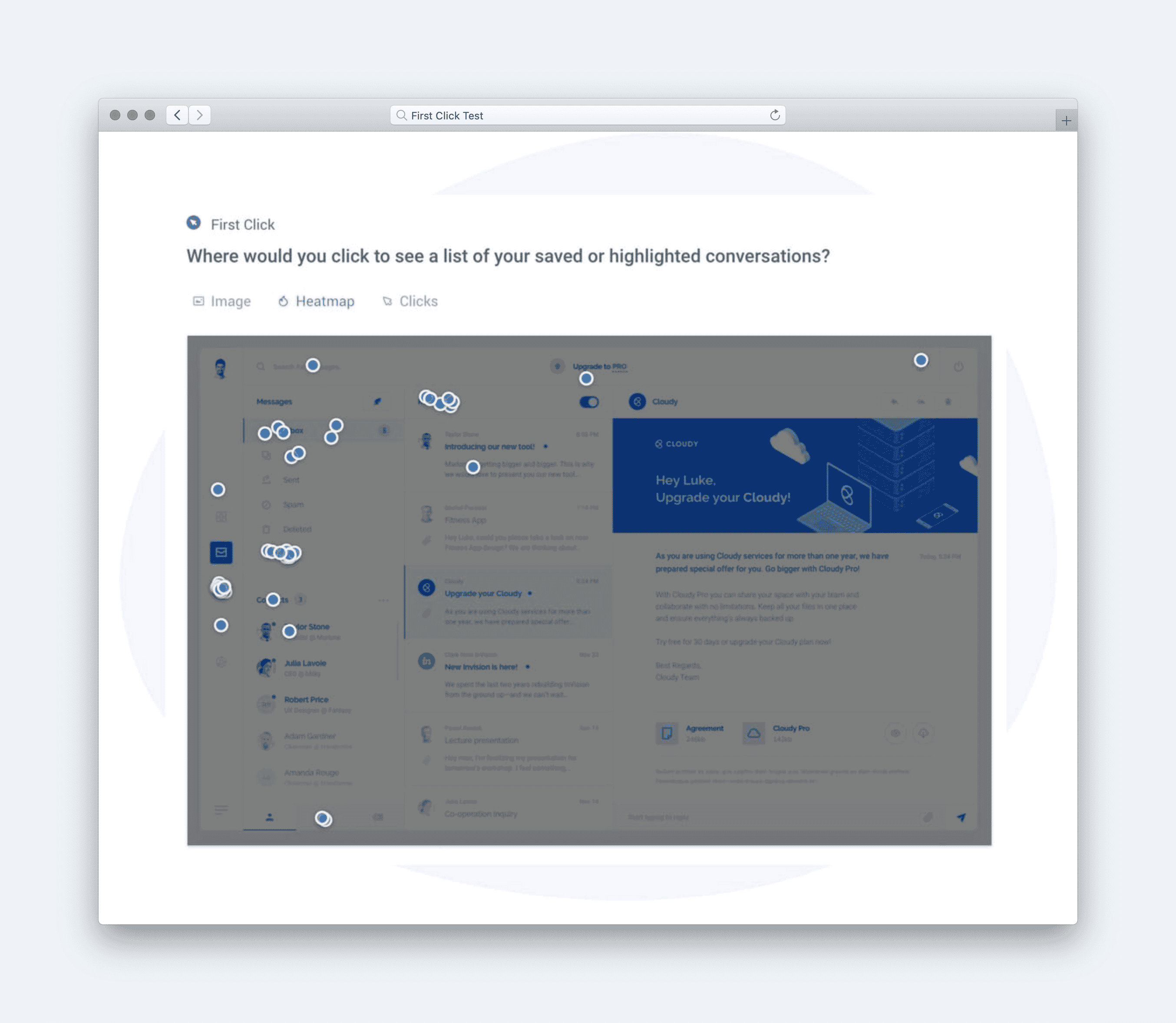
- **Engagement (First-click test)**
Question type: Click test.
Example: “Where would you click first if you wanted to narrow these results to find the best desk organizer for your needs?”
[Image]
- **Success (Click test directive)**
Question type: Task-based click test.
Example: “Where would you click to filter results by material, such as wood or metal?”
[Image]
- **Satisfaction (Likert scale of satisfaction)**
Question type: Satisfaction scale.
Example: “Overall, how satisfied are you with the experience of browsing and filtering desk organizers on this page?” (Very Dissatisfied → Very Satisfied)
[Image]
- **Sentiment (Multiple-choice impressions)**
Question type: Impression checklist.
Example: “Which of the following words best describe your impression of this search results page?” (Positive: Helpful, Inspiring, Organized, Trustworthy. Negative: Confusing, Overwhelming, Cluttered, Unclear)
[Image]
Calculate UX Metric Scores from User Feedback
For Etsy’s Search Results Page with Filters, we measured how effectively users could explore products, refine results, and feel confident navigating toward the next step in their shopping journey. The design stack for this test included Engagement, Success, Satisfaction, and Sentiment — a mix of behavioral and attitudinal metrics aligned to users browsing and narrowing down product options.
Each metric score was calculated on a 0–100% scale using the standard benchmarks below:
-
Very Good = 90% and above
-
Good = 70%–89%
-
Average = 50%–69%
-
Poor = 30%–49%
-
Very Poor = below 30%
An overall test score of 56% (Average) reflects a search experience that functions but struggles to keep users engaged and emotionally confident as they browse and refine results.
Etsy’s Results
**Engagement (55% — Average):** Participants interacted with the page but did not strongly gravitate toward paging or deeper exploration. While users scanned products successfully, many hesitated before moving forward, suggesting that result prioritization and visual hierarchy may not clearly guide next steps.
**Success (50% — Average):**
Users were generally able to filter products, but success rates indicate friction when applying or adjusting filters. Some participants were unsure which filters would meaningfully narrow results, slowing task completion and reducing confidence.
**Satisfaction (81% — Good):**
Despite usability challenges, participants reported positive feelings toward Etsy’s filter options themselves. Filters were perceived as robust, familiar, and flexible, contributing to a sense that the tools could be helpful, even if they weren’t always easy to use efficiently.
**Sentiment (39% — Poor):**
Emotional impressions were notably negative. Users frequently described feeling overwhelmed by the volume of results and visual density of the page, which reduced enjoyment and made browsing feel more effortful than expected.
[Image]
Together, these scores contributed to an Average overall experience (56%), showing that Etsy’s search results page offers strong filtering tools but falls short in guiding attention and maintaining positive momentum. Improving visual clarity, reducing overwhelm, and better signaling how filters impact results would help turn capable tooling into a more confident and engaging shopping experience.
Click here to check out the raw survey data and UX metric scores for Etsy’s search results page.
Draw Signals from Your Design Stack
Here’s how signals were surfaced from Etsy’s search results page test results by following the five steps:
1. Focus on poorly scoring metrics
[Image]
Etsy’s filtered search results page received an overall score of 56% (Average), with Sentiment (39%) scoring Poor, while Engagement (55%) and Success (50%) hovered at the low end of Average. In contrast, Satisfaction (81%) performed well, indicating that users ultimately felt okay about the experience once they settled into it. This imbalance points to a front-loaded emotional problem: users feel overwhelmed and uncertain early in the experience, even if they can eventually find what they need. The key signal: the page works functionally, but its complexity creates immediate negative emotional reactions that suppress confidence and exploration.
2. Identify patterns across metrics
[Image]
The combination of poor Sentiment and average Engagement suggests cognitive overload. Users are presented with too many products, filter options, and visual signals at once, making it hard to orient themselves quickly. Even though the filtering tools are powerful, the density of information creates friction before users feel in control. Satisfaction rebounds because Etsy’s inventory is strong, but that recovery happens after users push through the initial overwhelm. This reflects a pattern where value exists, but clarity is delayed.
3. Determine if user needs are being met
[Image]
-
Findable: Partially met — filters exist, but their prominence and volume make it harder to quickly locate the right controls.
-
Usable: Met — once users engage with filters, interactions are familiar and functional.
-
Efficient: Partially met — too much scanning and decision-making slows progress.
-
Valuable: Met — results generally feel relevant once refined.
-
Insightful: Not met — users struggle to understand how filters meaningfully narrow results without trial and error.
4. Compare outcomes to your business goals
-
Increase Product Discovery: Partially achieved — strong inventory, but discovery is slowed by overwhelm.
-
Boost Conversion Rates: At risk — early negative sentiment can discourage commitment.
-
Reduce Bounce & Refinement Fatigue: Not achieved — complexity contributes to drop-off.
-
Promote High-Value Listings: Supported — once filters are used, quality results surface.
-
Collect Search & Filter Insights: Supported — user behavior provides rich data, though experience quality limits impact.
5. Surface signals & establish a direction
Signals derived from the data:
-
Emotional overload is the primary blocker, not lack of functionality.
-
Strong satisfaction shows users want to stay once they regain control.
-
Filters work best after users invest effort, not when they first arrive.
**Direction based on business context:**
To improve engagement and conversion earlier in the journey, next steps should include:
-
Reducing visual noise by grouping or progressively revealing filters.
-
Adding clearer hierarchy and defaults to guide first interactions.
-
Using micro-feedback (e.g., result previews or filter impact indicators) to build confidence faster.
Based on the signals and design direction, we created an updated version of the design with the expected UX metric improvement:
[Image]
The signal is clear: Etsy’s filtered search experience delivers value, but overwhelming first impressions undermine trust and momentum—clarity and restraint will unlock its full potential.