[Image]
Event registration pages play a critical role in converting interest into attendance. For product designers and managers, the challenge is ensuring the registration flow is clear, trustworthy, and easy to complete while reinforcing the value of the event.
Event Registration Page Testing uses a design stack of UX metrics: comprehension, success, sentiment, and satisfaction to measure how effectively the page communicates and guides users through registration. This approach replaces subjective opinions with measurable insights.
With these findings, designers and managers can make informed design decisions, prioritize improvements, and demonstrate the impact of changes on business outcomes. For example, testing Salesforce’s Dreamforce registration page revealed strong comprehension but weaker satisfaction, showing where the form design and confirmation flow could be refined to create a smoother signup experience.
Define Goals for Your Event Registration Page
An event registration page should balance user needs like clarity, trust, and convenience with business goals such as conversion, attendance, and lead quality. Users want a frictionless sign-up process that feels trustworthy and worth their time, while businesses want to ensure the registration experience drives qualified participants and reinforces brand reputation. Measuring registration performance ensures the design delivers both ease and impact.
**Audience:**
To define user needs, you first need to establish who your audience is. In the case of our Dreamforce example, we targeted marketers, biz dev managers, and other CRM users who may have a need for Salesforce’s offerings.
User Needs
As a professional registering for a business event, the five most important needs would be:
-
The form and steps should be simple, straightforward, and easy to complete without confusion. (Form should be Usable)
-
The page should clearly communicate the benefits of attending, such as learning opportunities or networking. (Page should be Valuable)
-
The registration experience should feel legitimate and professional, matching the quality of the event. (Experience should be Credible)
-
The process should be fast, minimizing unnecessary fields or friction before confirmation. (Process should be Efficient)
-
The design and copy should build excitement and motivate users to complete their registration. (Design should be Desirable)
These five ensure the event registration experience feels clear, motivating, and trustworthy, meeting expectations for professional audiences.
Business Goals
Here are the five most important business goals for an event registration page:
-
Increase Registrations – Maximize the number of completed sign-ups from target audiences.
-
Improve Lead Quality – Attract relevant attendees who align with event goals and partner interests.
-
Reinforce Brand Credibility – Deliver a polished experience that reflects the company’s authority and professionalism.
-
Reduce Drop-off Rates – Minimize abandonment during registration by simplifying steps and providing clear progress cues.
-
Capture Actionable Data – Gather attendee information that supports marketing, outreach, and event planning.
These goals help the business drive attendance, strengthen brand reputation, and generate high-quality leads through an effective event registration experience.
Choose Metrics to Test Your Event Registration Page
For Salesforce’s Dreamforce event registration page, a design stack of four UX metrics was chosen to measure how effectively the registration experience builds trust, motivates sign-ups, and communicates value. This stack — Loyalty, Intent, Desirability, and Sentiment — was established by mapping user needs directly to measurable outcomes:
-
Credible → Loyalty
The registration page should reinforce trust in Salesforce’s brand and event experience. Loyalty measures whether visitors feel confident enough to register and whether they would recommend attending to others. -
Usable & Efficient → Intent
Signing up should feel simple and seamless. Intent evaluates whether participants express motivation to complete their registration or continue exploring event details after their first interaction. -
Desirable → Desirability
The event experience should look inspiring and feel worth joining. Desirability measures whether the page’s visuals, layout, and messaging make participants excited to attend. -
Valuable → Sentiment
Visitors should leave with a positive impression that the event offers meaningful value. Sentiment captures whether the page creates feelings of interest, excitement, or trust toward the brand and the event itself.
Establish Hunches to Direct Your Testing
Event registration pages play a pivotal role in driving sign-ups, so every design element — from headline clarity to CTA placement, must work together to reduce friction and boost excitement. By starting with hunches about potential usability or motivation gaps, we can shape questions that validate whether the design is truly converting visitors into attendees.
Example: Salesforce Dreamforce Registration Page
<table xmlns="http://www.w3.org/1999/xhtml" style="min-width: 75px;"><colgroup><col style="min-width: 25px;"><col style="min-width: 25px;"><col style="min-width: 25px;"></colgroup><tbody><tr><th colspan="1" rowspan="1"><p>Hunch</p></th><th colspan="1" rowspan="1"><p>Question</p></th><th colspan="1" rowspan="1"><p>UX Metric</p></th></tr><tr><td colspan="1" rowspan="1"><p>The page’s hero section and event details may prioritize brand imagery over clarity — users might miss when, where, and how much the event costs at first glance.</p></td><td colspan="1" rowspan="1"><p>After viewing this page, how clearly do you understand the event details (date, location, cost)?</p></td><td colspan="1" rowspan="1"><p><a target="_blank" rel="noopener noreferrer nofollow" href="https://glare.helio.app/define/ux-metrics/behavioral-metrics/comprehension">Comprehension</a></p></td></tr><tr><td colspan="1" rowspan="1"><p>The pricing cards use a visually appealing design, but differences between tiers (Launch Special, Early Bird, Last Chance, etc.) might be confusing or feel repetitive.</p></td><td colspan="1" rowspan="1"><p>Which ticket option makes the most sense to you, and why?</p></td><td colspan="1" rowspan="1"><p><a target="_blank" rel="noopener noreferrer nofollow" href="https://glare.helio.app/define/ux-metrics/behavioral-metrics/comprehension">Comprehension</a></p></td></tr><tr><td colspan="1" rowspan="1"><p>The registration CTAs (“Register now”) are frequent but may lack hierarchy — users might not know which one applies to them (e.g., team rates vs. individual).</p></td><td colspan="1" rowspan="1"><p>Which ‘Register now’ button would you click first, and what do you expect will happen next?</p></td><td colspan="1" rowspan="1"><p><a target="_blank" rel="noopener noreferrer nofollow" href="https://glare.helio.app/define/ux-metrics/behavioral-metrics/intent">Intent</a></p></td></tr><tr><td colspan="1" rowspan="1"><p>The FAQ accordion near the bottom may be too buried to address key hesitations — users with questions could bounce before discovering those answers.</p></td><td colspan="1" rowspan="1"><p>Was there any question about the event you still had after viewing the page?</p></td><td colspan="1" rowspan="1"><p><a target="_blank" rel="noopener noreferrer nofollow" href="https://glare.helio.app/define/ux-metrics/attitudinal-metrics/sentiment">Sentiment</a></p></td></tr><tr><td colspan="1" rowspan="1"><p>The imagery and testimonials strongly convey excitement, but may not provide enough practical justification (ROI, agenda, or session value) for business decision-makers.</p></td><td colspan="1" rowspan="1"><p>Does this page make the event feel worth the price of admission?</p></td><td colspan="1" rowspan="1"><p><a target="_blank" rel="noopener noreferrer nofollow" href="https://glare.helio.app/define/ux-metrics/attitudinal-metrics/desirability">Desirability</a></p></td></tr></tbody></table>
These hunches test whether Salesforce’s event registration experience balances clarity, motivation, and trust, ensuring visitors quickly find what they need and feel confident completing their registration.
Turn Hunches into Test Questions
Turning these metrics into participant questions transforms design assumptions into measurable signals. Each metric uses a specific question type paired with a clear example from Salesforce’s Dreamforce event registration page:
- Desirability **(5-pt Likert scale & Sentiment multiple choice)**
Question type: Agreement & Impression checklist.
Examples:
-
This event looks exciting and worth attending.” (Strongly Disagree → Strongly Agree)
-
Which of the following words best describe your impression of this registration page?” (Positive: Exciting, Professional, Trustworthy, Clear. Negative: Confusing, Unconvincing, Overwhelming, Dull)
[Image]
- Sentiment **(Multiple-choice impressions)**
Question type: Impression checklist.
Example: “Which of the following words best describe your impression of Dreamforce as an event?” (Positive: Innovative, Inspiring, Organized, Engaging. Negative: Overwhelming, Confusing, Impersonal, Expensive)
[Image]
- Intent **(Multiple-choice action selection)**
Question type: Action preference.
Example: “Which of the following actions would you most likely take next on this page?” (e.g., Register for the event, Learn more about speakers, Explore pricing, Leave the page)
[Image]
- Loyalty **(Likelihood to promote)**
Question type: 10-point likelihood scale.
Example: “How likely are you to recommend attending Dreamforce to a colleague or friend?” (0 = Not at all likely, 10 = Extremely likely)
[Image]
Calculate UX Metric Scores from User Feedback
For Salesforce’s Dreamforce event registration page, participant responses were analyzed and converted into UX metric scores on a 0–100% scale. Each metric in the design stack — Desirability, Intent, and Loyalty — was measured through survey and interaction data, then benchmarked using the following scale:
-
Very Good = 90% and above
-
Good = 70%–89%
-
Average = 50%–69%
-
Poor = 30%–49%
-
Very Poor = below 30%
Salesforce’s Results:
-
Desirability (78% — Average): The event’s visuals and messaging resonated with users, but didn’t strongly motivate sign-ups or emotional excitement.
-
Intent (33% — Poor): Few participants expressed clear motivation to register or learn more about Dreamforce, showing weak conversion appeal in the design.
-
Loyalty (45% — Poor): Participants were hesitant to recommend the event to peers, suggesting that the registration experience failed to fully convey the value of attendance.
[Image]
These results produced an overall test score of 52% — Average. While the Dreamforce registration page effectively communicates the event’s offering, it lacks the persuasive impact and urgency needed to drive engagement and advocacy. Strengthening calls-to-action, reinforcing exclusive event value, and improving alignment between visuals and key conversion moments can help turn initial curiosity into confirmed sign-ups.
Click here to check out the raw survey data and UX metric scores for Dreamforce's event registration page.
Draw Signals from Your Design Stack
Here’s how signals were surfaced from the Dreamforce event registration results by following these five steps:
1. Focus on poorly scoring metrics
[Image]
The test results for Salesforce’s Dreamforce registration page show poor intent (34%) and poor loyalty (46%), suggesting that while visitors find the page attractive, they’re not motivated to take action or return. Desirability (78%) performs moderately well, showing that the design draws positive attention and communicates appeal, but doesn’t translate into sign-ups or ongoing interest. The overall test score of 53% indicates the registration experience is underperforming where it matters most — converting enthusiasm into completion.
2. Identify patterns across metrics
[Image]
The metrics reveal that the Dreamforce registration page succeeds in design polish but fails in persuasive power. Users recognize the event’s quality and visual credibility but feel uncertain about next steps or the urgency of registration. High desirability paired with weak intent and loyalty suggests that while the page looks good and feels trustworthy, it doesn’t communicate enough value or clarity to inspire action.
3. Determine if user needs are being met
[Image]
-
Usable: Partially met — the registration steps appear simple, but unclear CTAs may cause hesitation.
-
Valuable: Not fully met — the benefits of attending aren’t emphasized enough to convince users to register immediately.
-
Credible: Met — the page feels legitimate and consistent with Salesforce’s professional brand.
-
Efficient: Partially met — the process seems straightforward but lacks clear momentum cues (like progress indicators or confirmation reassurances).
-
Desirable: Met — users find the page visually appealing and emotionally engaging, supporting first impressions but not follow-through.
4. Compare outcomes to your business goals
-
Increase Registrations: At risk — weak intent and loyalty indicate users aren’t converting despite page appeal.
-
Improve Lead Quality: Limited — unclear messaging around event benefits may attract curiosity but not qualified sign-ups.
-
Reinforce Brand Credibility: Supported — the page’s professional design reinforces Salesforce’s authority.
-
Reduce Drop-off Rates: Weak — low intent suggests potential drop-offs before or during registration.
-
Capture Actionable Data: Limited — fewer completed registrations reduce opportunities for insight collection.
5. Surface signals & establish a direction
Signals derived from the data:
-
Strong visual appeal but weak motivation — users admire the design but don’t feel compelled to act.
-
Brand credibility is high but benefits are vague — users trust Salesforce but lack clear reasons to register.
-
Emotional draw doesn’t convert to engagement — enthusiasm doesn’t carry through to meaningful action.
Direction based on business context:
To align with Salesforce’s goals of increasing registrations and improving lead quality, design priorities should focus on:
-
Strengthening value propositions and attendee benefits (e.g., key speakers, sessions, networking opportunities).
-
Reinforcing urgency with clearer calls to action and deadline-driven messaging.
-
Simplifying the sign-up flow with visible progress cues and confirmation reassurances to reduce hesitation.
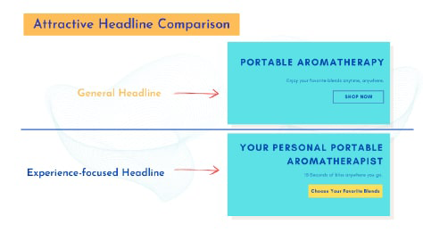
Based on the signals and design direction, we created an updated version of the design with the expected UX metric improvement:
[Image]
Salesforce’s direction is clear: Dreamforce’s event registration page builds excitement and credibility but fails to drive conversions. By clarifying the event’s value and strengthening motivational CTAs, Salesforce can turn interest into sign-ups and maximize attendance impact.