[Image]
This experience represents the moment where a new user decides whether a design tool feels usable or overwhelming. People arrive wanting to start creating, but first need to understand what kind of space they are in and whether it will support their work. For the business, this moment directly supports early activation and sets the tone for ongoing engagement.
The starting canvas screen for Canvas Tools was tested by asking participants to imagine opening the tool for the first time and reacting to what they saw. The test focused on comprehension, sentiment, and intent to understand how clearly the space communicates purpose, how it makes people feel, and whether it encourages action. Together, these metrics surface how quickly users orient themselves and whether that orientation leads to momentum or hesitation.
Starting-state experiences often hide the earliest breakdowns in confidence. When people hesitate here, they rarely recover later without guidance. Testing this moment helps teams see where clarity, emotion, and motivation drift apart, so they can better support users before uncertainty turns into abandonment.
User Needs & Business Goals
This experience aims to give new users enough orientation to confidently take a first step, while supporting the business goal of early activation. People want to quickly understand what’s possible and how to begin, and the product needs to reduce hesitation so momentum starts right away.
Audience
This concept was tested with U.S.-based adults who were asked to imagine they had just opened a design canvas tool for the first time. Participants reviewed the initial blank canvas screen and were asked to react to what they saw, how it made them feel, and what they would do next.
User Needs
When users first land on a blank canvas, they are trying to quickly orient themselves and decide whether they can move forward with confidence.
-
The experience should clearly signal what actions are available without requiring exploration or guesswork (intuitive).
-
The canvas should feel straightforward to interact with, even for first-time users (usable).
-
Users should be able to locate their next step quickly and without scanning the entire screen (findable).
-
The environment should feel stable and trustworthy, not broken or blocked (reliable).
-
The starting state should feel worth engaging with, not empty or discouraging (valuable).
Together, these needs help users move from arrival to action without losing confidence or momentum.
Business Goals
From a business perspective, this experience supports early-stage engagement and product adoption.
-
Increase First-Session Activation – Help new users take a meaningful first action quickly.
-
Reduce Early Drop-Off – Minimize confusion that leads users to abandon the tool.
-
Build Initial Trust – Ensure the product feels functional and dependable at first glance.
-
Support Learning Momentum – Encourage exploration by making the first step feel clear and safe.
-
Improve Trial-to-Use Conversion – Turn initial curiosity into hands-on usage.
When these goals are met, users gain confidence early, and the business benefits from stronger activation and long-term engagement.
Choose Metrics to Test Your Canvas Tools
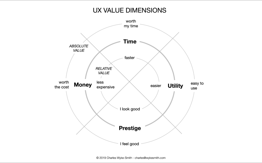
This test examined the starting canvas experience for Canvas Tools. A focused design stack of UX metrics was selected by mapping early user needs to signals the team could observe and learn from. The metrics used were Comprehension, Sentiment, and Intent.
Intuitive → Comprehension
When users land on a blank canvas, they are trying to quickly understand what this space is and how it works. Comprehension helps capture whether people can orient themselves without instruction. It reflects how clearly the canvas communicates purpose and possibility at first glance.
Valuable → Sentiment
At the starting moment, users are also forming an emotional reaction to the space. Sentiment captures whether the canvas feels welcoming, discouraging, or neutral. It reflects whether the experience feels worth engaging with.
Findable → Intent
Once users understand what they are seeing, they look for a next step. Intent measures whether people can imagine what they would do next on the canvas. It captures clarity of direction rather than execution.
Establish Hunches to Direct Your Testing
Before testing, the team had a few open questions about how people would react to a blank canvas as a starting point. These hunches helped narrow where confidence might build or break down, and shaped questions that could surface early signals without jumping to solutions.
Example: Canvas Tools starting canvas
<table xmlns="http://www.w3.org/1999/xhtml" style="min-width: 75px;"><colgroup><col style="min-width: 25px;"><col style="min-width: 25px;"><col style="min-width: 25px;"></colgroup><tbody><tr><th colspan="1" rowspan="1"><p>Hunch</p></th><th colspan="1" rowspan="1"><p>Question</p></th><th colspan="1" rowspan="1"><p>UX Metric</p></th></tr><tr><td colspan="1" rowspan="1"><p>The empty canvas may leave first-time users unsure whether the product is ready for use or waiting for something else to happen. The lack of visible guidance could affect confidence in taking a first step.<br>Question</p></td><td colspan="1" rowspan="1"><p>How clear is it what you can do next when you first see this screen?</p></td><td colspan="1" rowspan="1"><p>Comprehension</p></td></tr><tr><td colspan="1" rowspan="1"><p>A locked or inactive state may make the experience feel broken rather than intentionally minimal. This could trigger negative emotional reactions before users understand the context.</p></td><td colspan="1" rowspan="1"><p>How do you feel about this screen as your starting point?</p></td><td colspan="1" rowspan="1"><p>Sentiment</p></td></tr><tr><td colspan="1" rowspan="1"><p>Even if users understand what the canvas is, they may struggle to imagine a concrete next action. Without a visible starting cue, momentum may stall.</p></td><td colspan="1" rowspan="1"><p>What would you be most likely to do next on this screen?</p></td><td colspan="1" rowspan="1"><p>Intent</p></td></tr></tbody></table>
Turn Hunches into Test Questions
Turning hunches into concrete questions helps remove ambiguity from early testing. Pairing each UX metric with a specific question type makes it clear what signal we are trying to capture and how participants will respond.
**Comprehension (Likert scale)**
Question type: Agreement scale
*Example:*
“How well do you understand what you can do next on this screen?”
(Strongly disagree → Strongly agree)
**Sentiment (Likert scale)**
Question type: Agreement scale
*Example:*
“This feels like a good place to start working.”
(Strongly disagree → Strongly agree)
**Intent (Open-ended response)**
Question type: Open-ended
*Example:*
“What would you be most likely to do next on this screen?”
Calculate UX Metric Scores from User Feedback
This concept examined the Canvas Tools starting canvas experience and how people respond when they first arrive. Participants were asked to imagine opening the canvas for the first time and deciding what to do next. The design stack included Comprehension, Sentiment, and Intent, combining attitudinal and behavioral signals to understand early confidence and momentum.
-
Very Good = 90% and above
-
Good = 70%–89%
-
Average = 50%–69%
-
Poor = 30%–49%
-
Very Poor = below 30%
Overall Test Score
35% — Poor, At a high level, this score indicates that the starting canvas creates friction early in the experience. While some understanding is present, confidence and motivation break down before users feel ready to engage.
**Comprehension (59% — Average):**
Many participants could tell they were looking at a design canvas and understood its general purpose. However, uncertainty surfaced around what actions were available or expected at this moment. This suggests partial orientation without full clarity on how to proceed.
**Sentiment (0% — Very Poor):**
Emotional response to the starting screen was strongly negative overall. The locked and empty state led several users to feel discouraged or question whether the tool was usable. Very few responses reflected excitement or comfort at this entry point.
**Intent (46% — Poor):**
Participants struggled to describe a clear next action. Some mentioned exploring tools, but many responses reflected hesitation or confusion. This indicates that understanding the space does not reliably translate into forward movement.
[Image]
Taken together, the scores show an experience that explains itself just enough to be recognized, but not enough to inspire action. The dominant tension is between structural clarity and emotional confidence, with stalled momentum at the moment users are deciding whether to engage or leave.
Click here to check out the raw survey data and UX metric scores for Miro’s canvas board.
Draw Signals from Your Design Stack
Here’s how signals were surfaced from Canvas Tools’ starting canvas test results by following five steps:
1. Focus on poorly scoring or imbalanced metrics
[Image]
The overall test score was 35% (Poor). Comprehension was the strongest metric, while sentiment was the weakest, with intent also trailing. People could partially understand what they were looking at, but many felt discouraged or uncertain about engaging with it. Signal: Understanding exists, but emotional response and motivation break down early, creating a risk of stalled momentum.
2. Identify patterns across metrics
[Image]
Comprehension and intent move together. When people understood what the space was, they were more likely to imagine a next step. Sentiment pulls the opposite direction. Even when users grasped the layout, the blank and locked state made the experience feel uninviting or broken. This reveals a tension between clarity and confidence. The screen explains itself just enough, but not enough to make people want to act.
3. Determine if user needs are being met
[Image]
-
Intuitive: Partially met — Some users could infer what the canvas was, but many still hesitated about what to do next.
-
Usable: Partially met — The tools appear familiar, but the empty state limits perceived interaction.
-
Findable: Not met — Clear next steps were difficult to locate or infer from the screen.
-
Reliable: Not met — The locked board message caused some users to question whether the tool was working.
-
Valuable: Partially met — A few users appreciated the simplicity, but many did not see immediate value.
4. Compare outcomes to business goals
-
Increase First-Session Activation: At risk — Low sentiment and intent signal hesitation at the starting moment.
-
Reduce Early Drop-Off: At risk — Confusion and negative emotion increase the chance of abandonment.
-
Build Initial Trust: At risk — The locked state undermines confidence in the product’s readiness.
-
Support Learning Momentum: Partially supported — Some understanding is present, but it does not consistently translate into action.
-
Improve Trial-to-Use Conversion: At risk — Weak motivation limits progression beyond first view.
5. Surface signals & establish a direction Signals derived from the data:
[Image]
-
Users can identify the canvas, but struggle to decide how to begin.
-
Emotional response is strongly negative despite moderate comprehension.
-
A locked or empty state interrupts confidence at a critical entry point.
-
Lack of direction slows momentum more than lack of understanding.
Direction based on business context:
The evidence points toward an experience that explains itself structurally but not behaviorally. People need reassurance and guidance at the moment they arrive, or they pause instead of progressing. Without that support, early confidence erodes before value can be felt.
Closing synthesis:
This starting canvas currently functions as a neutral workspace, not a welcoming entry point. The dominant signal is stalled momentum caused by low emotional confidence at the exact moment users are deciding whether to engage or leave