Connect Decisions to Measurable Outcomes
The Decision Map is the operational system that connects user needs, design signals, decisions, and outcomes across product and design work.
Modern product workflows move across research, testing, AI systems, reviews, metrics, stakeholders, and business goals. As work speeds up, teams often lose connection between those parts. The Decision Map helps teams keep direction connected as work moves through Define, Measure, Focus, and Lead.
As work speeds up, teams often lose connection between those pieces.
What a Decision Map Is
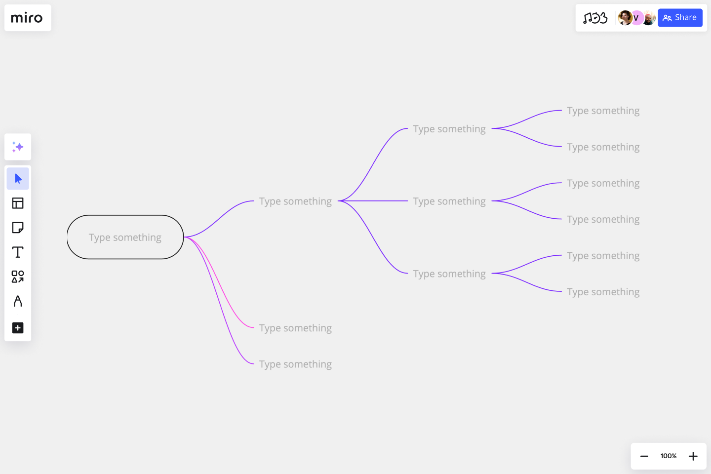
The Decision Map connects the full path from user needs to measurable outcomes so decisions stay aligned across the workflow.
[Image]
The problem is that these pieces often sit in different places. Research lives in one doc. Metrics live in another tool. Decisions happen in meetings. Outcomes get reported later. The Decision Map connects the chain.
It helps you see:
-
What user need started the work
-
What signals were captured
-
What the team learned
-
What decision was made
-
What outcome changed
The thread between them starts to break. The Decision Map helps teams keep that thread connected while product work is still moving.
Why it Matters
Work often loses strength as it moves forward.
-
A problem is defined clearly at the start, but becomes vague later.
-
Signals are captured, but not used in decisions.
-
Metrics are tracked, but don’t influence direction.
-
Outcomes are discussed, but not tied back to the original problem.
From the outside, the work looks active. Meetings happen. Tests run. Screens change. Reports get shared. Inside the work, the thread starts to break.
The Decision Map helps keep that thread intact. It makes sure:
-
What you define is what you measure
-
What you measure is what you use to decide
-
What you decide connects to an outcome
-
What you learn feeds the next cycle
That is what turns design work from separate activities into a connected decision system.
How Decisions Move in Glare
Every decision follows the same path through Glare. It starts with understanding the problem, moves through testing and learning, becomes a clear direction, and ends in measurable outcomes.
Each facet plays a specific role in that flow:
The Decision Map helps you see how a decision moves through each of these stages without losing clarity along the way.
[Image]
Define
Understand what matters
Define is where the work becomes grounded. At this stage, the team is not trying to solve anything yet. They are working to clearly understand what is actually happening and why it matters. This is where decisions get their starting point.
[Image]
The team focuses on:
-
Identifying real user needs, not just requests
-
Understanding who the audience is and how they behave
-
Clarifying the context around the problem
-
Agreeing on what success should look like
When Define is strong, the rest of the work has something real to respond to. When Define is weak, teams test ideas without a clear reason. The work may move forward, but it becomes harder to know whether it is solving the right problem.
👉 Go deeper: Define what matters
Measure
Validate what users actually respond to
Measure is where ideas meet reality. Once the problem is clear, the team starts testing possible ways to improve it. Instead of debating internally, they put ideas in front of users and observe what actually happens. This is where learning happens.
[Image]
The team works through:
-
Concepts that represent possible solutions
-
Hunches that need to be validated or challenged
-
Questions that uncover real behavior
-
Findings that show patterns in the data
This is where signals are created. Signals turn raw feedback into evidence the team can use. They show whether an idea makes sense, creates confidence, causes friction, or helps people move forward. Without Measure, decisions rely on assumptions. With Measure, teams can see how users actually respond before decisions fully scale.
👉 Go deeper: Measure what works
Focus
Decide what should move forward
Focus is where the work narrows. By this point, the team has enough signal to stop exploring and start deciding. The goal shifts from generating ideas to choosing a direction. This is where direction becomes clear.
[Image]
The team:
-
Uses the right methods to validate what matters
-
Tracks performance through design KPIs
-
Compares results across versions or benchmarks
-
Makes decisions based on what holds up
This is often where teams get stuck. Without strong signals, Focus turns into debate. People revisit the same questions, defend preferences, or wait for more proof. When the earlier steps are clear, Focus becomes easier. The team can see the tradeoffs, choose a path, and explain why that choice makes sense.
👉 Go deeper: Focus on what to do
Lead
Connect decisions to impact
Lead is where the decision proves its value. After a direction is chosen, the work doesn’t stop. The team needs to understand what actually changed and why it matters to the business. This is where outcomes become visible.
[Image]
The team connects decisions to:
-
Business goals like growth, retention, or efficiency
-
Workflows across product, marketing, and other teams
-
Relationships between UX metrics and product KPIs
-
Results that can be tracked and explained
This is where design work becomes visible to leaders. Without Lead, decisions feel isolated. A team may know the work improved, but they cannot clearly show why it mattered. With Lead, teams can connect product and design work back to measurable business impact.
👉 Go deeper: Lead what it drives
Use the Decision Map
The Decision Map is not just something to understand. It is something teams actively use while product work is moving. The fastest way to start is by using AI Skills and structured workflows built around the map.
Teams use the Decision Map to:
-
Connect UX Metrics to decisions
-
Connect signals to outcomes
-
Trace decisions from problem to impact
-
Compare tradeoffs more clearly
-
Align teams around measurable direction
Over time, the map creates a more consistent way of making and evaluating decisions.
Example: Map one decision
A product team is preparing to simplify a mobile onboarding flow. The team already has:
-
Multiple onboarding concepts
-
UX Metrics from testing
-
Stakeholder concerns around adoption
-
AI-generated workflow variations
Define
The team identifies that users are struggling to understand the next step after account setup.
Measure
The team tests multiple onboarding directions using:
-
Comprehension
-
Usability
-
Task success
-
Confidence metrics
Signals reveal where users hesitate and which flow creates stronger understanding.
Focus
One onboarding direction consistently performs better across key metrics and creates less confusion. The team chooses that direction because the evidence holds up across user response and workflow performance.
Lead
The onboarding decision connects back to:
-
Activation
-
Support reduction
-
Onboarding completion
-
Product adoption
The team can now explain why the decision mattered beyond the interface itself. This is the purpose of the Decision Map. It connects:
-
The problem
-
The measurable evidence
-
The decision
-
The outcome
into one connected story.
Connecting the System
The Decision Map sits across all four facets of Glare and connects them into a continuous flow.
A decision doesn’t stop at any one step. It moves forward, building on what came before it. It starts in Define, where user needs and problems are clarified. Those needs then move into Measure, where they are turned into ideas that can be tested. What is learned there produces signals, and those signals carry into Focus, where the team uses them to make a clear decision. That decision then moves into Lead, where it becomes an outcome that can be seen and understood.
That outcome doesn’t end the process. It feeds back into Define, shaping how the next problem is understood. This creates a loop rather than a straight line. Each time the cycle runs, decisions become clearer because they are built on what was learned before.
What the map makes visible
One of the main benefits of the Decision Map is that it makes the work easier to follow.
Instead of seeing disconnected steps, you can see how everything relates. You can trace where a signal came from, how it was measured, how it influenced a decision, and what changed because of it.
It shows the chain between:
-
Signal
-
Metric
-
Decision
-
Outcome
This matters because teams often lose the connection between what they learned and what they chose.
A finding may be useful, but if it does not shape the decision, it fades. A metric may be tracked, but if it does not connect to an outcome, it becomes reporting. A decision may be made, but if no one can explain the impact, it becomes hard to defend later.
The map keeps those pieces connected. It helps teams see what happened, why it happened, and what should happen next.
What improves when the map is clear
When the Decision Map is working well, the way teams make decisions starts to shift.
-
Signals don’t get lost as work moves from one group to another. They continue to shape direction instead of fading into the background.
-
Metrics become part of decision-making, not just something that is reported after the fact. Conversations move faster because the team is building on shared evidence instead of revisiting the same questions.
-
Decisions feel more grounded and easier to commit to. There is a clearer line from the problem to the outcome, which makes the work easier to explain and easier to trust.
Over time, this creates consistency. Teams start to approach decisions in the same way, which reduces friction and helps the system hold together.
What breaks when it’s missing
When the Decision Map is weak or not used, those connections start to fall apart.
-
Define and Measure drift away from each other. What gets tested no longer clearly ties back to the original problem.
-
Signals are still collected, but they don’t strongly influence decisions. Focus becomes more dependent on opinion, since the connection to evidence is weaker.
-
Lead becomes harder to prove. Outcomes may exist, but the path from decision to impact is unclear.
The work still happens, but it becomes difficult to connect cause and effect. Without that connection, it’s harder to learn from decisions and harder to repeat what worked.
Where this fits in Glare
Each part of Glare supports a different part of decision-making:
-
UX Metrics create measurable evidence
-
Design Signals turn evidence into direction
-
AI Skills help shape and structure decisions
-
Design Reviews align conversations around evidence
-
Design Assessment evaluates where decision quality weakens
The Decision Map is what keeps everything aligned as work moves forward. The Decision Map connects Define, Measure, Focus, and Lead into a single flow. It shows how decisions move from user needs to measurable outcomes.
By keeping each step connected, it helps teams:
-
Make clearer decisions
-
Move faster with more confidence
-
Connect product direction to measurable outcomes
-
Maintain alignment while work is still evolving
That is what turns separate activities into a connected operational decision system.